6 Data visualization basics with ggplot2
6.1 Built-in plots with the ca package
Normally, we present CA results as a graph. You can use the base R plot() function directly on the output of ca() for quick results.
plot(berry_ca_res)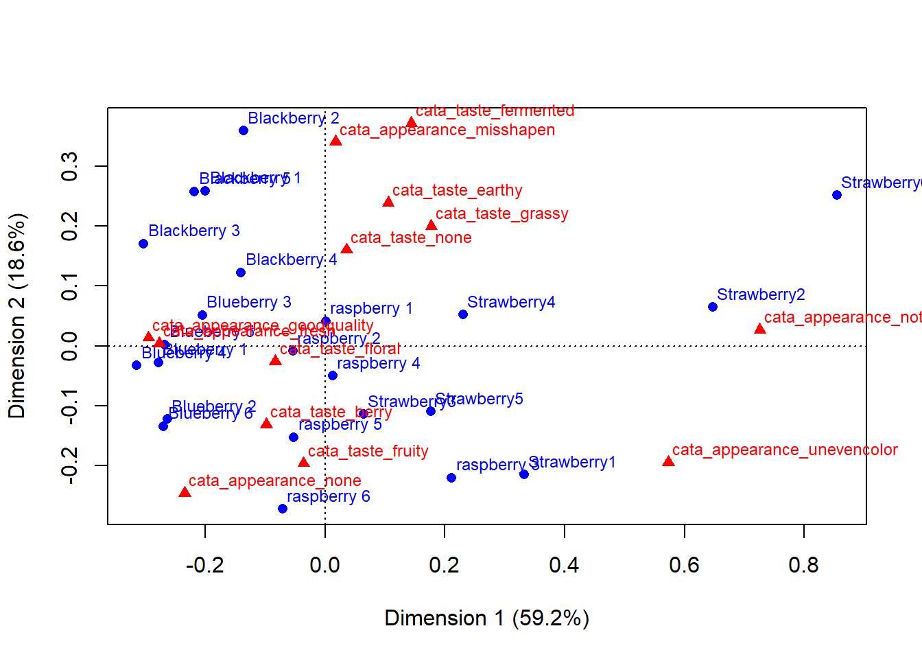
You can learn some things from this already: Strawberries 1 & 2 had some appearance defects that made them noticably different from the others. The blackberries were generally more earthy, while many of the raspberries and strawberries had more fruity/berry flavor. Often, multivariate data analysis packages have pretty good defaults built into their packages that you should take advantage of to quickly look at your data.
But it’s hard to see what’s going on with the blueberries. A lot of the text is impossible to read. And some additional color- or shape-coding with a key would be helpful.
6.2 Basics of Tidy Graphics
If you want to make this look publication-friendly by getting rid of overlapping text, changing font size and color, color-coding your berries, etc, you can do this with base R’s plotting functions. The help files for ?plot.ca and pages 262-268 in Greenacre’s Correspondence Analysis in Practice demonstrate the wide variety of options available (although Greenacre also explains on pages 283-284 that he used a variety of non-base R tools to make figures for the book). In general, however, it’s much easier to use the tidyverse package ggplot2 to manipulate graphs.
ggplot2 provides a standardized, programmatic interface for data visualization, in contrast to the piecemeal approach common to base R graphics plotting. This means that, while the syntax itself can be challenging to learn, syntax for different tasks differs in logical and predictable ways and it works well together with other tidyverse functions and principles (like select() and filter()).
The schematic elements of a ggplot are as follows:
# The ggplot() function creates your plotting environment.  We often save it to a variable in R so that we can use the plug-n-play functionality of ggplot without retyping
p <- ggplot(mapping = aes(x = <a variable>, y = <another variable>, ...),
            data = <your data>)

# Then, you can add various ways of plotting data to make different visualizations.
p +
  geom_<your chosen way of plotting>(...) +
  theme_<your chosen theme> +
  ...
In graphical form, the following diagram (from VT Professor JP Gannon) gives an intuition of what is happening:
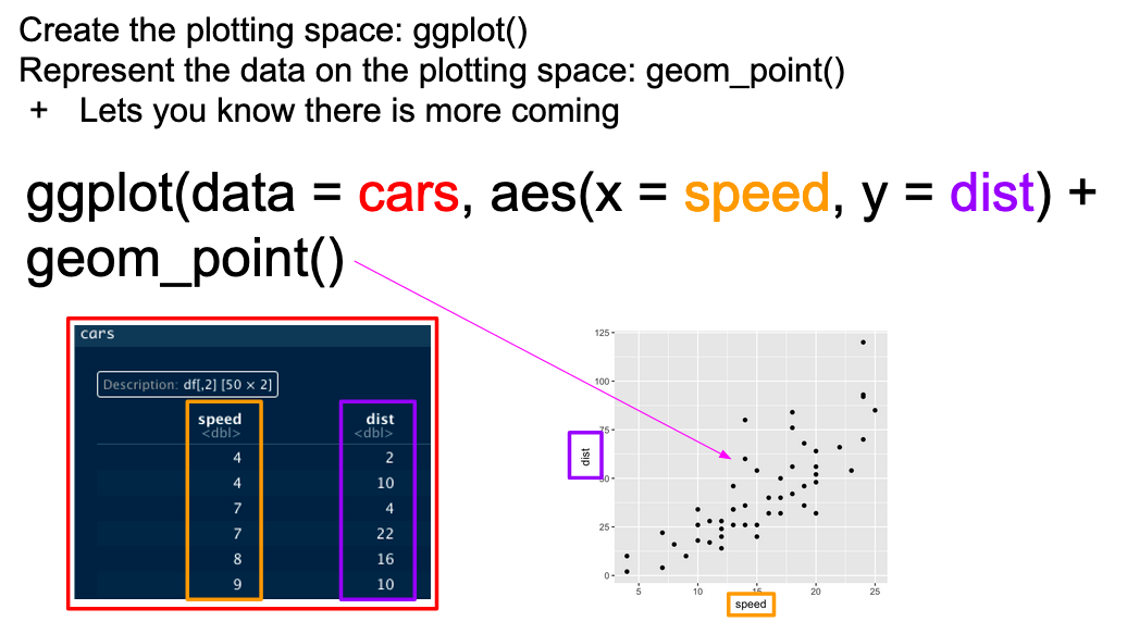
Basic ggplot mappings. Color boxes indicate where the elements go in the function and in the plot.
Since ggplot2 is a tidyverse package, we do need to (re)tidy the data (and, often, keep reshaping it after that). In general, ggplot2 works best with data in “long” or “tidy” format: one row for every observation or point.
By default, the scatterplot function needs one row per point with one column of coordinates for each axis (normally x and y):
berry_data %>%
  # Here we set up the base plot
  ggplot(mapping = aes(x = lms_appearance, y = lms_overall)) +
   # Here we tell our base plot to add points
  geom_point()
## Warning: Removed 5005 rows containing missing values (`geom_point()`).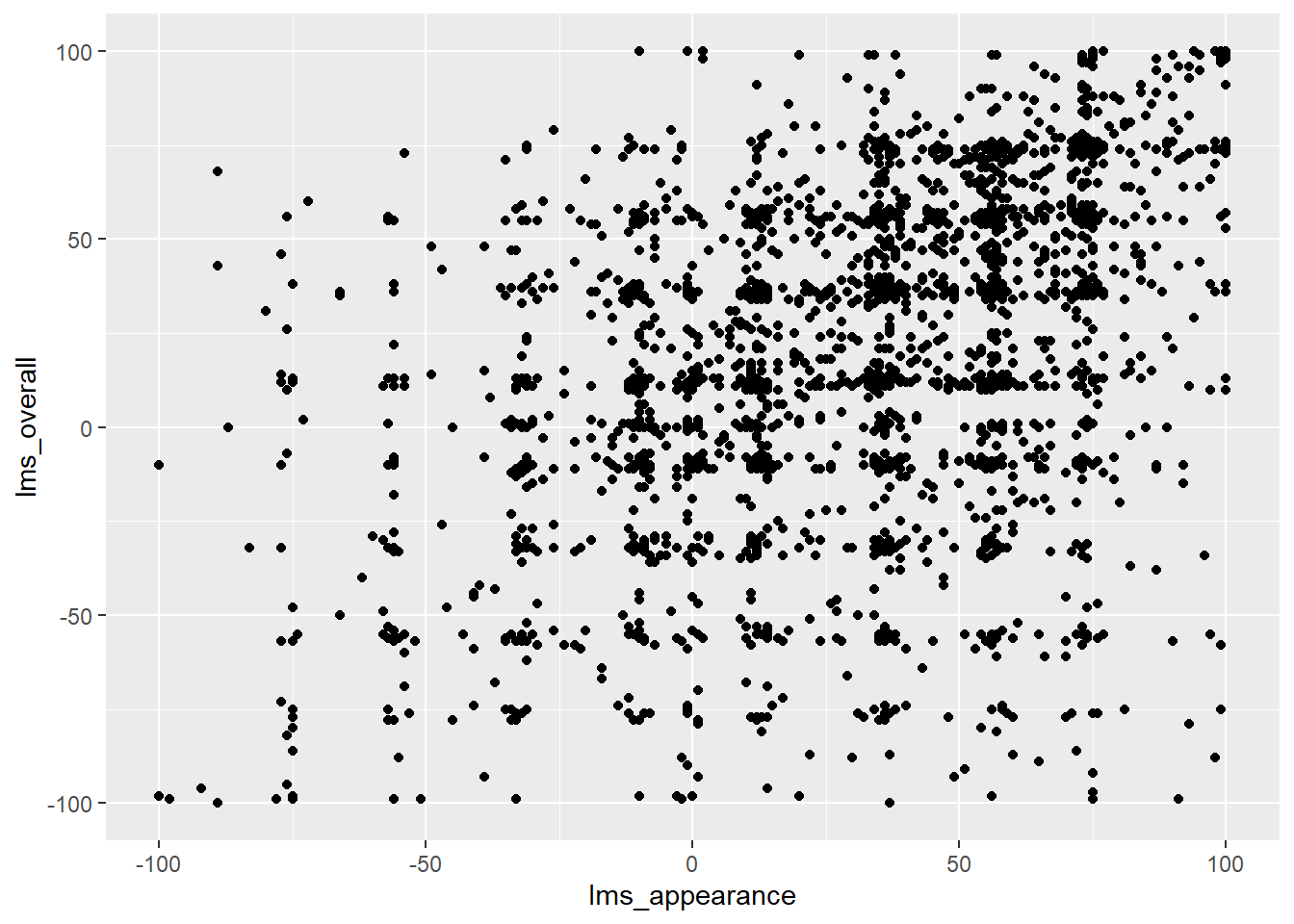
This doesn’t look all that impressive–partly because the data being plotted itself isn’t that sensible, and partly because we haven’t made many changes. If we want to plot some summary data, maybe one point per berry sample, we can use the familiar tidyverse functions to reshape our data and pipe it into ggplot().
berry_data %>%
  select(`Sample Name`, contains(c("9pt_","lms_","us_"))) %>%
  summarize(across(everything(), ~ mean(.x, na.rm = TRUE)), .by = `Sample Name`) ->
  berry_average_likings

berry_average_likings %>%
  nrow()
## [1] 23berry_average_likings %>%
ggplot(aes(x = `9pt_overall`, y = `lms_overall`)) +
#23 points, one per row
geom_point()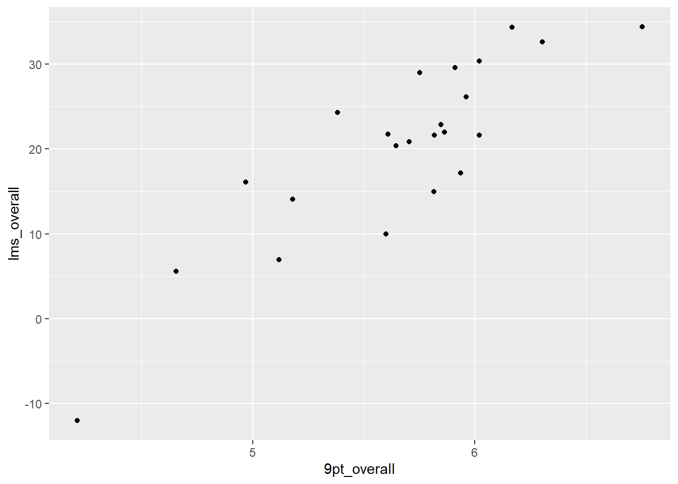
This plot has fewer overlapping points and less noise, so it’s a lot more informative. But it still doesn’t look that good, with the underscores in the axis labels, the printer-unfriendly grey background, etc. Let’s start looking at the pieces that make up a ggplot so we can change them.
6.2.1 The aes() function and mapping = argument
The ggplot() function takes two arguments that are essential, as well as some others you’ll only use in specific cases. The first, data =, is straightforward, and you’ll usually be passing data to the function at the end of some pipeline using %>%
The second, mapping =, is less clear. This argument requires the aes() function, which can be read as the “aesthetic” function. The way that this function works is quite complex, and really not worth digging into here, but it’s the place where you tell ggplot() what part of your data is going to connect to what part of the plot. So, if we write aes(x = rating), we can read this in our heads as “the values of x will be mapped from the ‘rating’ column”.
This sentence tells us the other important thing about ggplot() and the aes() mappings: mapped variables each have to be in their own column. This is another reason that ggplot() requires tidy data.
6.2.2 Adding layers with geom_*() functions
In the above example, we added (literally, using +) a function called geom_point() to the base ggplot() call. This is functionally a “layer” of our plot, that tells ggplot2 how to actually visualize the elements specified in the aes() function–in the case of geom_point(), we create a point for each row’s combination of x = lms_overall and y = 9pt_overall.
berry_average_likings %>%
  select(lms_overall, `9pt_overall`)
## # A tibble: 23 × 2
## lms_overall `9pt_overall`
## <dbl> <dbl>
## 1 32.6 6.30
## 2 26.1 5.96
## 3 22.0 5.86
## 4 34.3 6.17
## 5 15.0 5.82
## 6 16.1 4.97
## 7 21.6 5.82
## 8 5.60 4.66
## 9 6.92 5.12
## 10 20.4 5.65
## # ℹ 13 more rowsThere are many geom_*() functions in ggplot2, and many others defined in other accessory packages like ggrepel. These determine what symbols and spatial arrangements are used to represent each row, and are the heart of visualizations. Some geom_*() functions do some summarization of their own, making them more appropriate for raw data.
We can see this by swapping out the geom_*() in our initial scatterplot on the Labeled Magnitude Scale liking data:
berry_data %>%
  ggplot(mapping = aes(x = lms_appearance, y = lms_overall)) +
  geom_smooth()
## `geom_smooth()` using method = 'gam' and formula = 'y ~ s(x, bs = "cs")'## Warning: Removed 5005 rows containing non-finite values (`stat_smooth()`).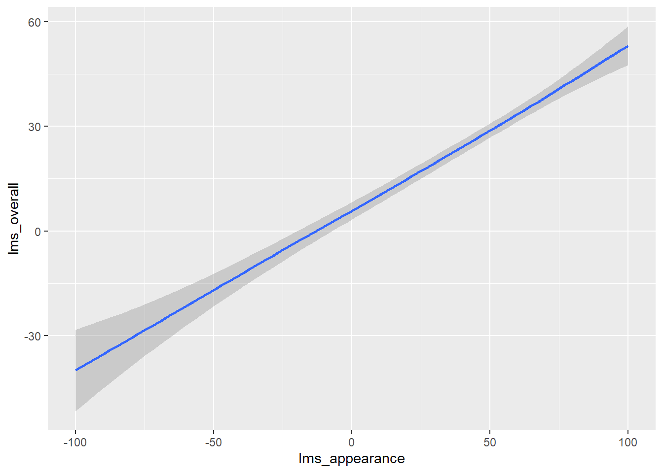
geom_smooth() fits a smoothed line to our data. By default, it will use either Local Polynomial Regression or the Generalized Additive Model, depending on the size of your data (here, you can see that it chose gam, the Generalized Additive Model). You can specify models manually, using the method argument of geom_smooth():
berry_data %>%
  ggplot(mapping = aes(x = lms_appearance, y = lms_overall)) +
  geom_smooth(method = "lm")
## `geom_smooth()` using formula = 'y ~ x'## Warning: Removed 5005 rows containing non-finite values (`stat_smooth()`).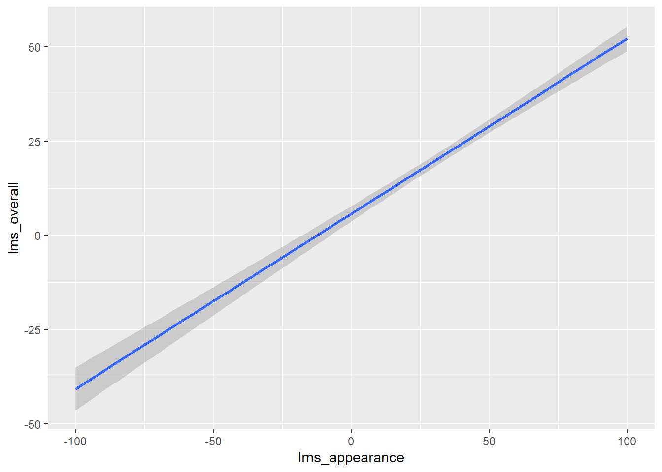
We can also combine layers, as the term implies:
berry_data %>%
  ggplot(mapping = aes(x = lms_appearance, y = lms_overall)) +
  geom_point() +
  geom_smooth()
## `geom_smooth()` using method = 'gam' and formula = 'y ~ s(x, bs = "cs")'## Warning: Removed 5005 rows containing non-finite values (`stat_smooth()`).## Warning: Removed 5005 rows containing missing values (`geom_point()`).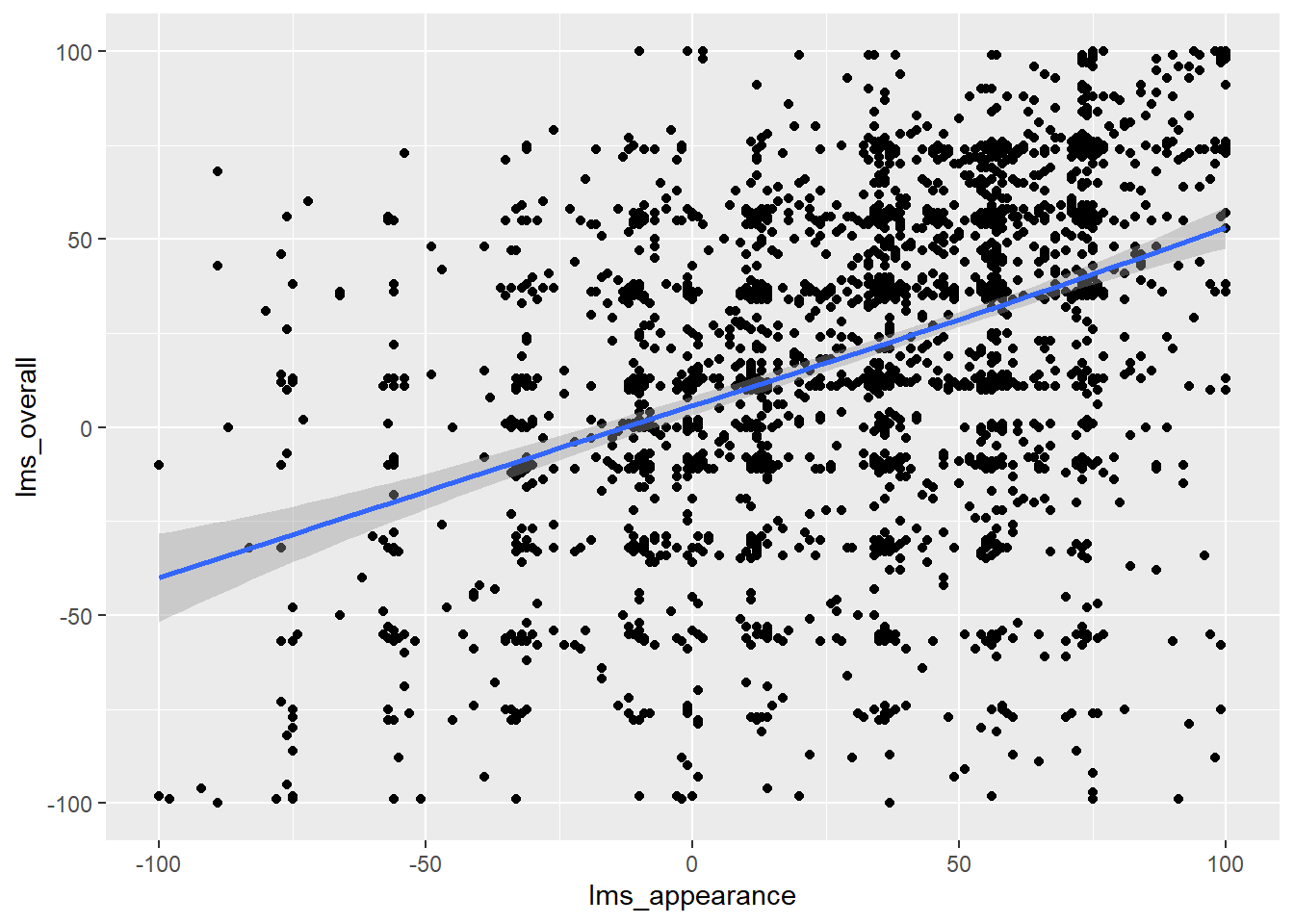
Note that we don’t need to tell either geom_smooth() or geom_point() what x and y are–they “inherit” them from the ggplot() function to which they are added (+), which defines the plot itself.
What other arguments can be set to aesthetics? Well, we can set other visual properties like color, size, transparency (called “alpha”), and so on. For example, let’s try to look at whether there is a relationship between berry condition (proxied here by cata_appearance_bruised) and overall liking.
berry_data %>%
  #ggplot will drop NA values for you, but it's good practice to
  #think about what you want to do with them:
  drop_na(lms_overall, cata_appearance_bruised) %>%
  #color, shape, linetype, and other aesthetics that would add a key
  #don't like numeric data types. The quick-and-dirty solution:
  mutate(across(starts_with("cata_"), as.factor)) %>%
  ggplot(mapping = aes(x = lms_appearance, y = lms_overall,
                       color = cata_appearance_bruised)) +
  geom_point(alpha = 1/4) +
  geom_smooth(se = FALSE) +
  theme_bw()
## `geom_smooth()` using method = 'gam' and formula = 'y ~ s(x, bs = "cs")'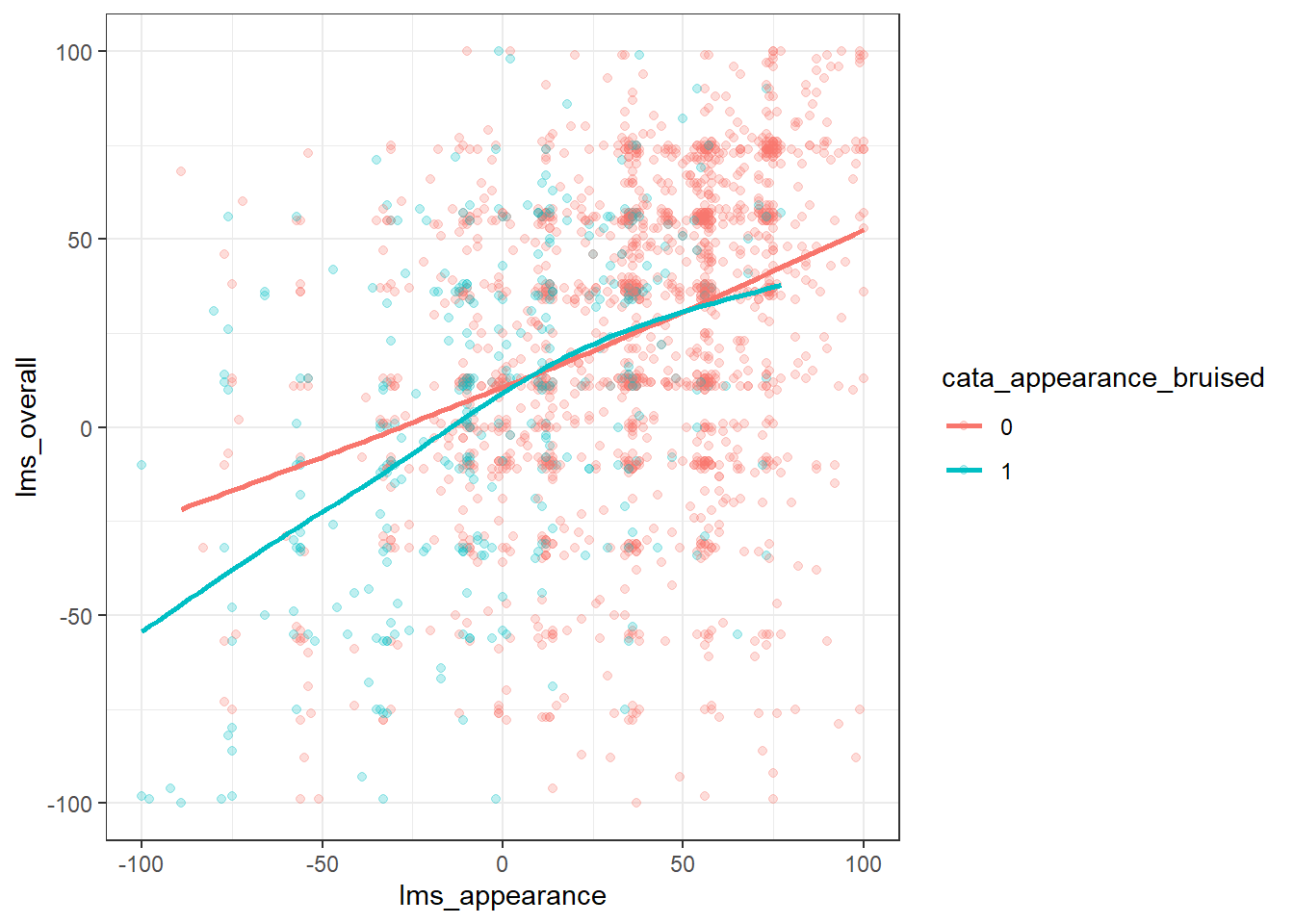
We can see that more of the blue dots for samples with a bruised appearance in the lower left of the figure–it has a negative influence on the ratings of overall liking and appearance.
6.2.3 Geoms for categorical, ordinal, or unevenly-distributed data
You may notice that we’ve been using the Labeled Magnitude Scale data so far, rather than the data from the other two scales. That’s because adding geom_point() to the 9-point hedonic scale data looks like this:
berry_data %>%
  ggplot(mapping = aes(x = `9pt_appearance`, y = `9pt_overall`)) +
  geom_point()
## Warning: Removed 5062 rows containing missing values (`geom_point()`).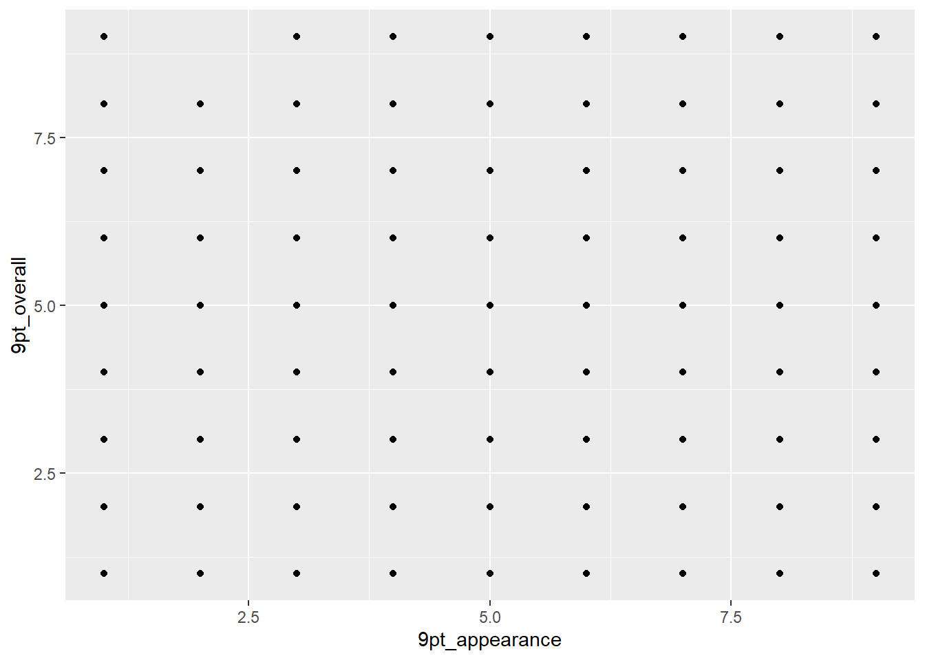
Each of those points actually represents many individual ratings of berries, possibly hundreds. There are almost certainly fewer people giving the berries a 1 for appearance and a 9 for overall liking than there are people rating each a 6. This also makes it a good demonstration of how ggplot handles the transparency of overlapping points:
berry_data %>%
  ggplot(mapping = aes(x = `9pt_appearance`, y = `9pt_overall`)) +
  geom_point(alpha = 0.05)
## Warning: Removed 5062 rows containing missing values (`geom_point()`).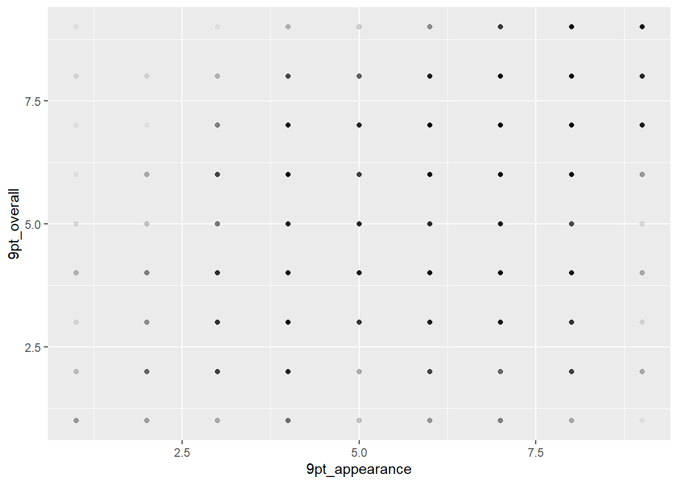
But the actual solution to this problem, instead of the hacky pseudo-heat map, is geom_jitter(), which applies a small random x and y offset to each point:
berry_data %>%
  ggplot(mapping = aes(x = `9pt_appearance`, y = `9pt_overall`)) +
  geom_jitter(alpha = 1/4) +
  geom_smooth(method = "lm", se = FALSE)
## `geom_smooth()` using formula = 'y ~ x'## Warning: Removed 5062 rows containing non-finite values (`stat_smooth()`).## Warning: Removed 5062 rows containing missing values (`geom_point()`).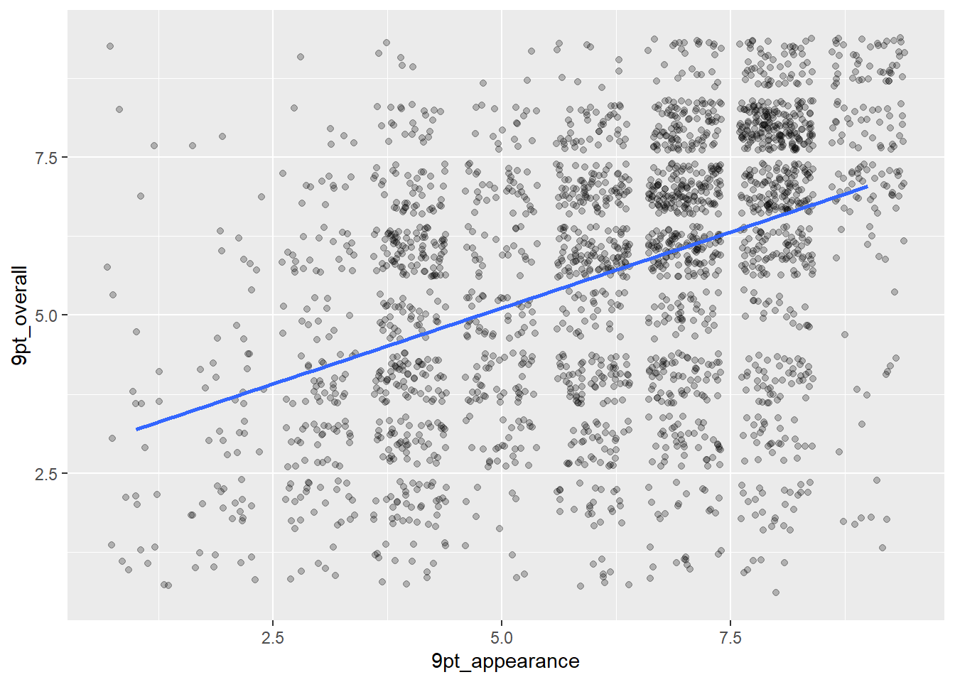
You can see there are some overlapping points left, but this gives us a much better idea of the shape, along with the summarizing geom_smooth(). Since there are only 9 possible values on the hedonic scale while the continuous Labeled Magnitude Scale allows people to select numbers in-between scale labels, geom_jitter() can be thought of as simulating this random human scale usage after the fact.
If you’d like to look at the variation of a single categorical or discrete variable, a bar plot is more appropriate. geom_bar() is another summarizing geom, similar to geom_smooth(), as it expects a discrete x variable and one row per observation. It will count the number of rows in each group and use those counts to plot the bar heights, one bar per group. (Note that you can override or tweak this behavior using additional arguments.)
geom_histogram() is the version for numeric data, which will also calculate bins for you.
#geom_bar() is for when you already have discrete data, it just counts:
berry_data %>%
  ggplot(aes(x = cata_taste_berry)) +
  geom_bar()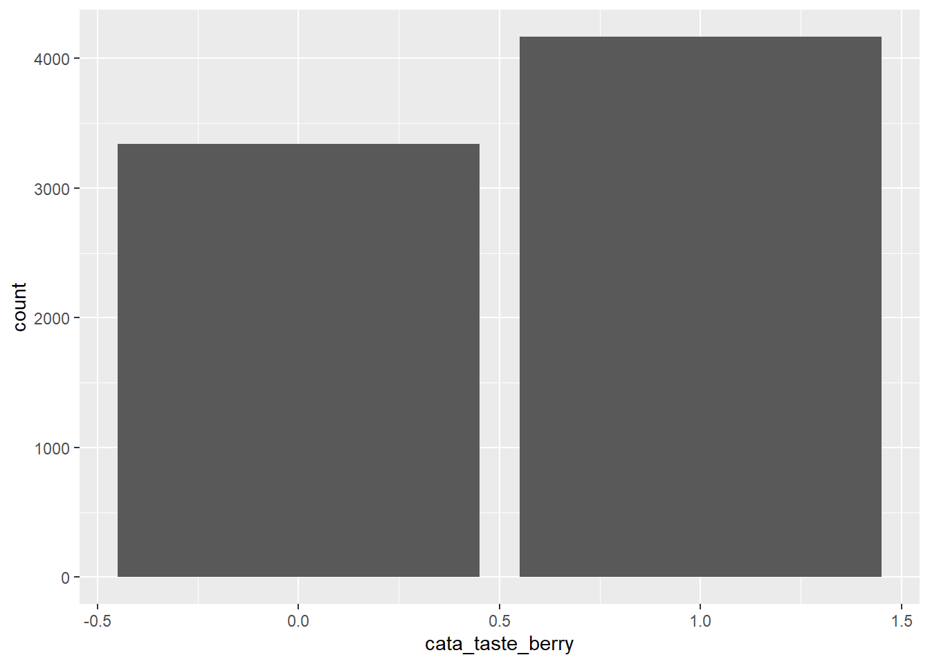
berry_data %>%
  ggplot(aes(x = `9pt_overall`)) +
  geom_bar()
## Warning: Removed 5062 rows containing non-finite values (`stat_count()`).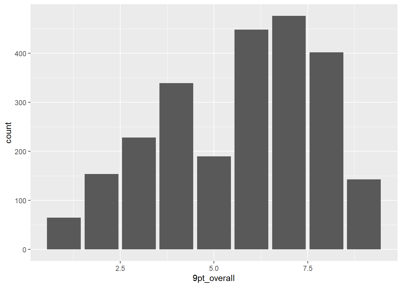
#and geom_histogram() is for continuous data, it counts and bins:
berry_data %>%
  ggplot(aes(x = `lms_overall`)) +
  geom_histogram()
## `stat_bin()` using `bins = 30`. Pick better value with `binwidth`.## Warning: Removed 5005 rows containing non-finite values (`stat_bin()`).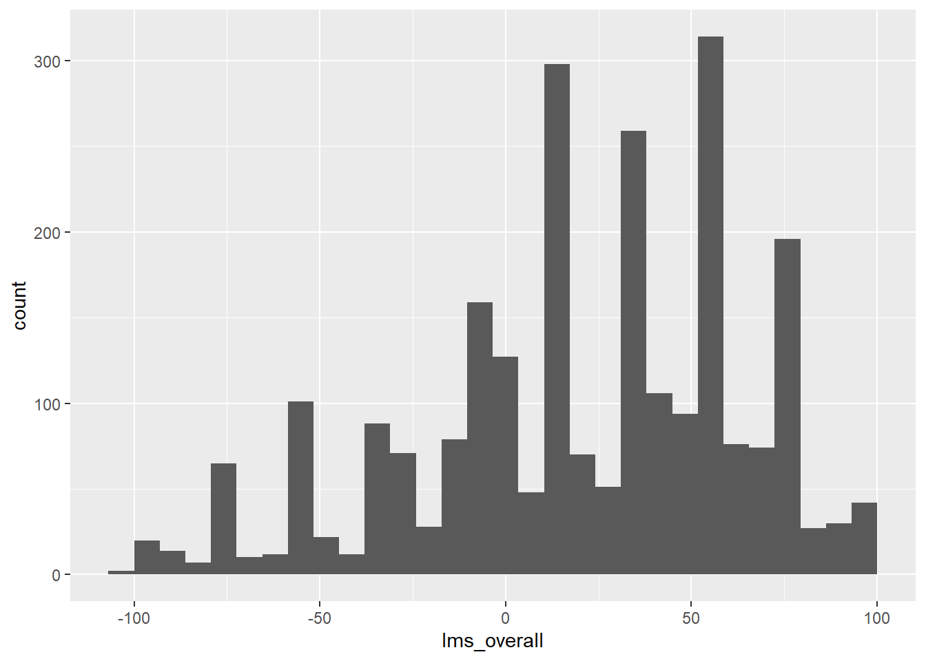
6.2.4 Arguments inside and outside of aes()
In some previous plots, we’ve seen some aesthetic elements specified directly inside of geom functions like geom_point(alpha = 1/4), without using aes() to map a variable to this aesthetic. If we want every point or geom to have the same, fixed look (the same transparency, the same color, etc), we don’t wrap it in the aes() function. aes() ties a visual element to a variable.
Note that we can map alpha to a variable, just like color:
berry_data %>%
  drop_na(lms_overall, cata_appearance_bruised) %>%
  ggplot(aes(x = lms_appearance, y = lms_overall)) +
  # We can set new aes() mappings in individual layers, as well as the plot itself
  geom_point(aes(alpha = jar_size)) +
  #Unlike color, alpha will accept numeric variables for mapping
  theme_bw()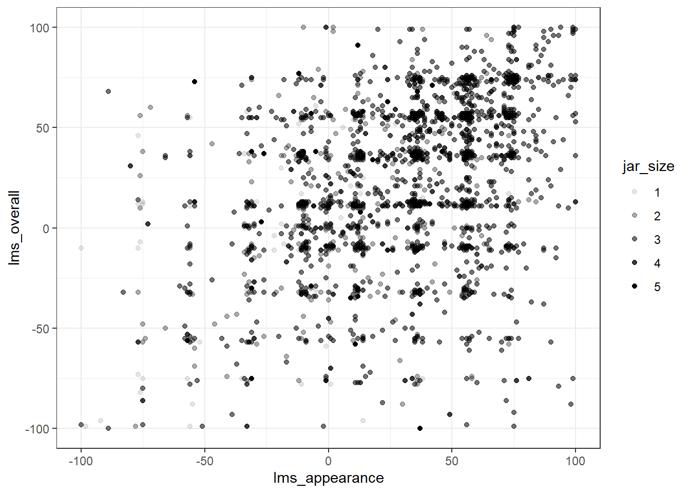
Color would be a better way to represent this relationship, however, as semitransparent points can overlap and appear indistinguishable from a single, darker point.
6.2.5 Using theme_*() to change visual options quickly
In the last plot, notice that we have changed from the default (and to my mind unattractive) grey background of ggplot2 to a black and white theme. This is by adding a theme_bw() call to the list of commands. ggplot2 includes a number of default theme_*() functions, and you can get many more through other R packages. They can have subtle to dramatic effects:
berry_data %>%
  drop_na(lms_overall, cata_appearance_bruised) %>%
  ggplot(aes(x = lms_appearance, y = lms_overall)) +
  geom_point() +
  theme_void()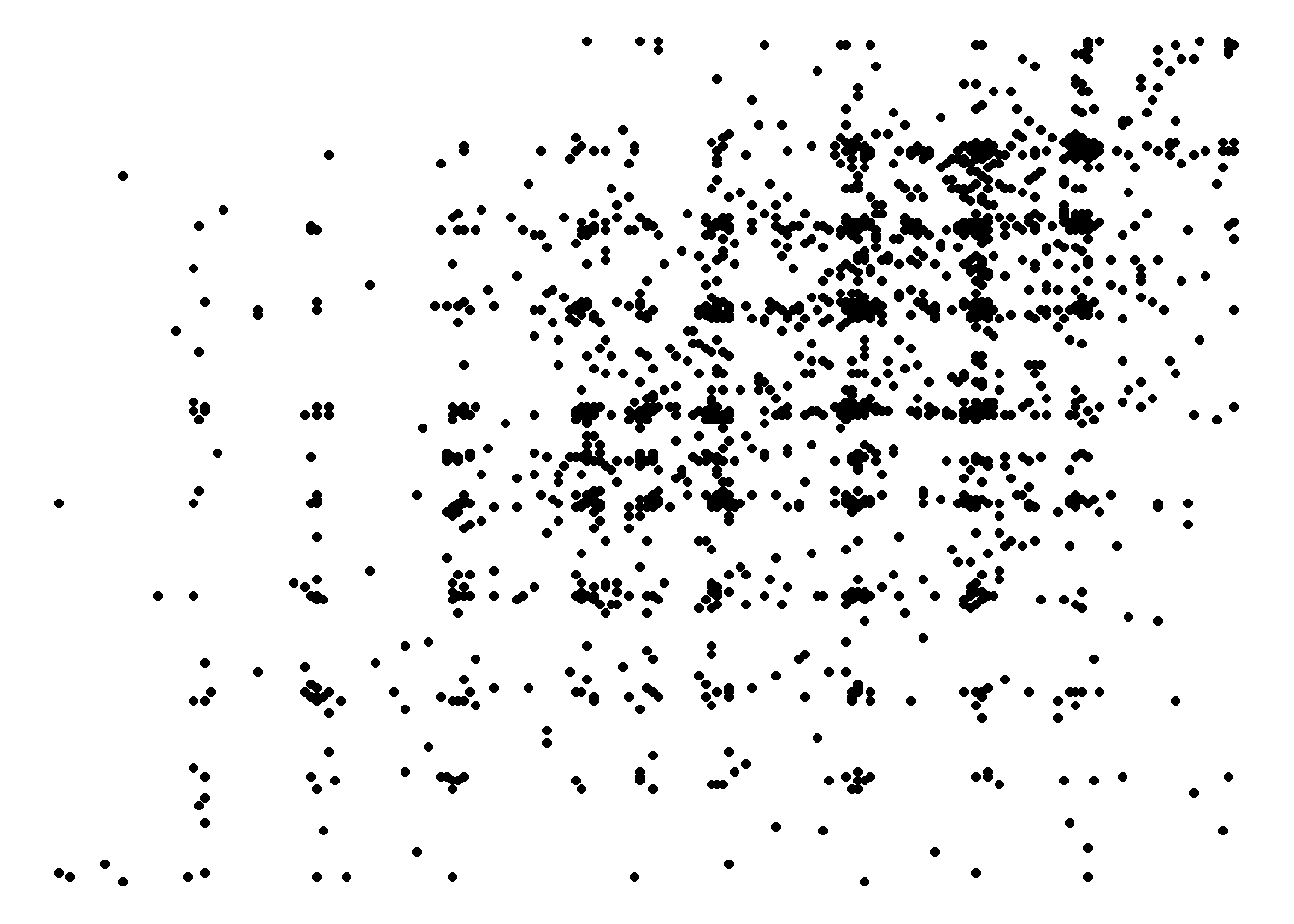
You can also edit every last element of the plot’s theme using the base theme() function, which is powerful but a little bit tricky to use.
6.2.6 Changing aesthetic elements with scale_*() functions
But what about the color of the points? None of the themes change the colors used for drawing geoms, or the color scales used for showing categories or additional variables.
The symbols, colors, or other signifiers mapped to aesthetic variables by mapping() are are controlled by the scale_*() functions. In my experience, the most frequently encountered scales are those for color: either scale_fill_*() for solid objects (like the bars in a histogram) or scale_color_*() for lines and points (like the outlines of the histogram bars).
Scale functions work by telling ggplot() how to map aesthetic variables to visual elements. The viridis package is a good starting place for color and fill scales, as its scale_color_viridis_*() functions provide color-blind and (theoretically) print-safe color palettes.
# To effectively plot all of the cata attributes on a bar chart, the data
# needs to be longer (one geom_bar() per group, not per column!)
# and we'll remove columns with NAs for now.
berry_cata_long <-
  berry_data %>%
  select(where(~none(.x, is.na))) %>%
  pivot_longer(starts_with("cata_"),
               names_to = c(NA, "Modality", "Attribute"), names_sep = "_",
               values_to = "Presence")

# And now we can use this for plotting
p <-
  berry_cata_long %>%
  filter(Presence == 1) %>%
  ggplot(aes(x = Attribute, fill = berry, color = Modality)) +
  geom_bar(position = position_dodge()) +
  theme_bw() +
  theme(axis.text.x = element_text(angle = 90, vjust = 0.5, hjust = 1))

p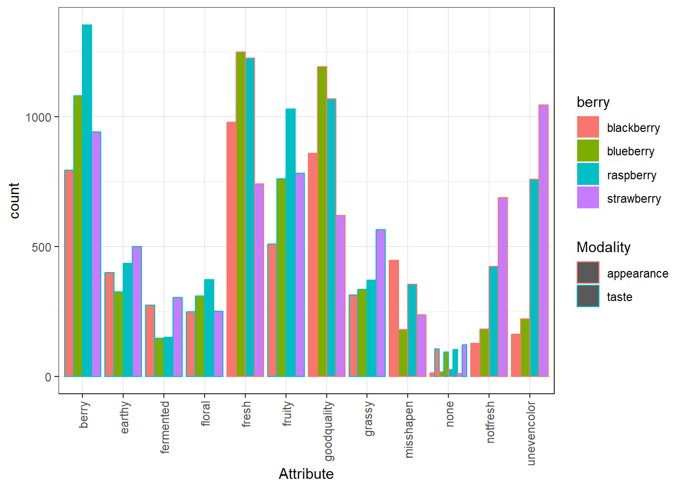
We can take a saved plot (like p) and use scales to change how it is visualized.
p +
  scale_fill_viridis_d() +
  scale_color_grey(start = 0, end = 0.8) #For bar plots, color is the outline!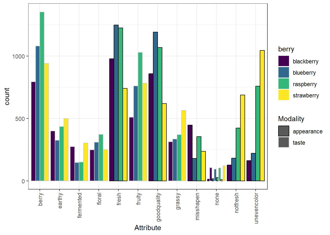
ggplot2 has a broad range of built-in options for scales, but there are many others available in add-on packages that build on top of it. You can also build your own scales using the scale_*_manual() functions, in which you give a vector of the same length as your mapped aesthetic variable in order to set up the visual assignment. That sounds jargon-y, so here is an example:
# We'll pick 14 random colors from the colors R knows about
random_colors <- print(colors()[sample(x = 1:length(colors()), size = 10)])
## [1] "turquoise" "dodgerblue4" "cadetblue3" "chocolate" "grey49"
## [6] "thistle1" "slateblue4" "grey74" "limegreen" "beige"p +
scale_fill_manual(values = random_colors) +
scale_color_manual(breaks = c("taste", "appearance"),
values = c("lightgrey", "black"))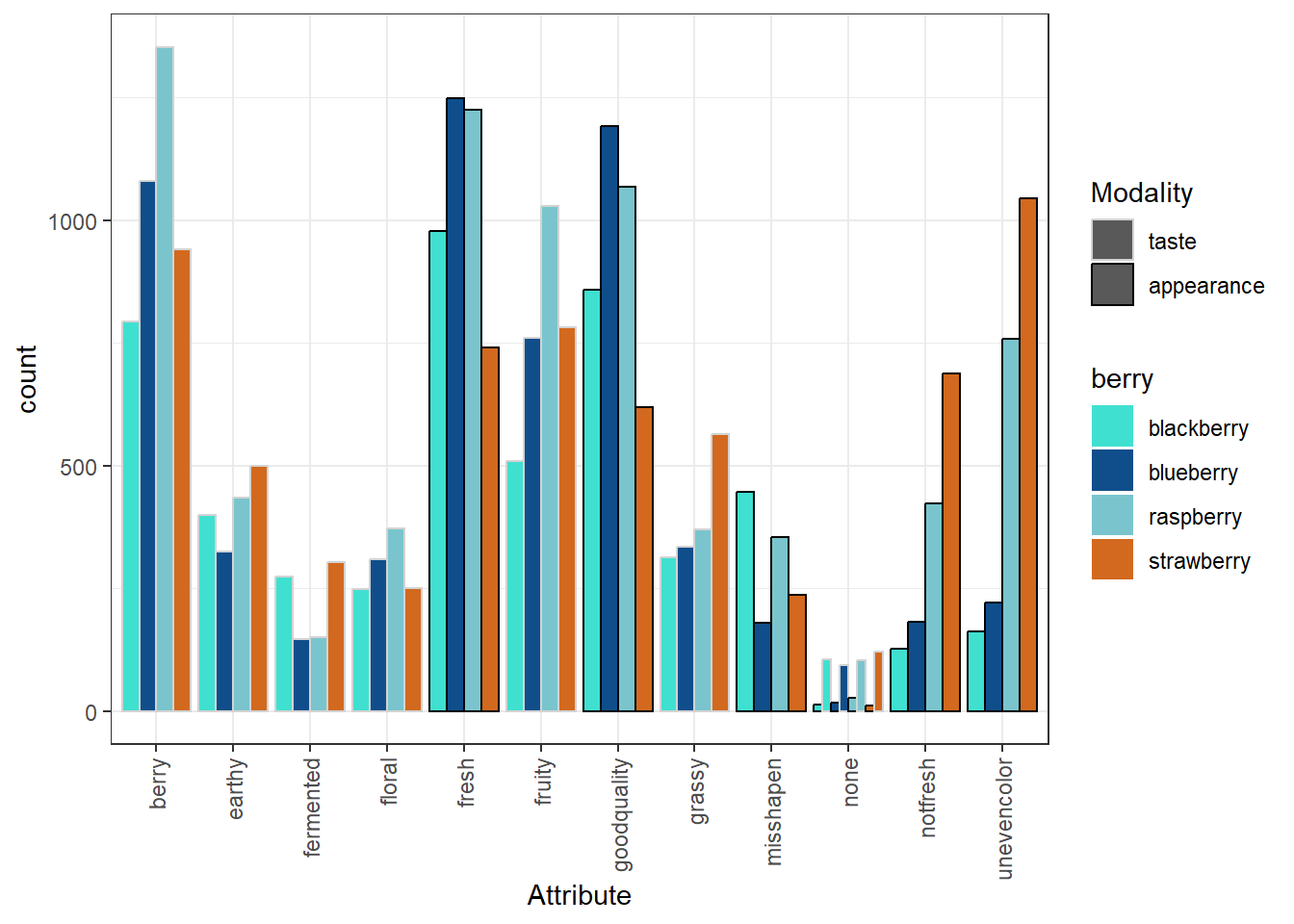
6.2.7 Finally, facet_*()
The last powerful tool I want to show off is the ability of ggplot2 to make what Edward Tufte called “small multiples”: breaking out the data into multiple, identical plots by some categorical classifier in order to show trends more effectively.
The bar plot we were just looking at is quite busy, even without displaying all 36 CATA questions. Instead, let’s see how we can break out separate plots, for example, different CATA attributes into “small multiple” facet plots to get a look at trends between berries one attribute at a time.
berry_cata_long %>%
  filter(Presence == 1) %>%
  ggplot(aes(x = berry)) +
  geom_bar() +
  theme_bw() +
  facet_wrap(~ Attribute) +
  theme(axis.text.x = element_text(angle = 90, vjust = 0.5, hjust = 1))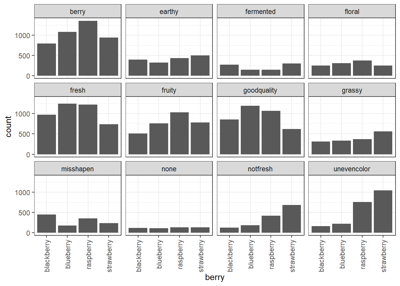
We can still compare the facets in this case, because they all share X and Y axes. The “none” attribute was checked much less often than the other attributes, for example. We can also see that uneven color was a more common problem among the raspberries and strawberries than the blueberries and blackberries, and that strawberries and blackberries more commonly had fermented flavor.
It would be good to go a step further and plot the percentages, rather than the raw counts, since not every berry had the exact same number of participants. We can use geom_col() instead of geom_bar() to do our own summarizing:
berry_cata_long %>%
  group_by(berry, Attribute, Modality) %>%
  summarize(proportion = mean(Presence)) %>%
  ggplot(aes(x = berry, y = proportion)) +
  geom_col() +
  theme_bw() +
  facet_wrap(~ Attribute) +
  theme(axis.text.x = element_text(angle = 90, vjust = 0.5, hjust = 1))
## `summarise()` has grouped output by 'berry', 'Attribute'. You can override
## using the `.groups` argument.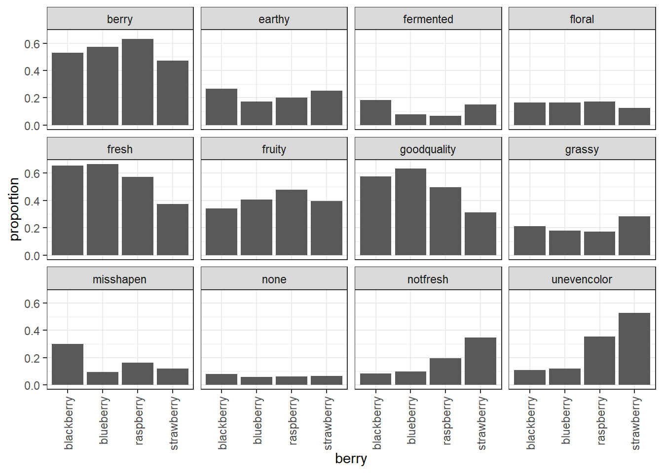
Both plots show that blueberries and raspberries are more commonly described by “berry flavor”, but looking at the proportions instead of the raw counts reveals that there aren’t strong differences in floral flavor across the berry types.
6.2.8 The ggplot rabbithole
Like many things we’re introducing today, you can make infinitely-complicated graphs using these same basic semantics. ggplot2 is a world of exceptions! You could eventually end up having to do something like this, where each geom_* has different data:
ggplot() +
  geom_segment(aes(xend = Dim1, yend = Dim2), x = 0, y = 0,
               arrow = arrow(length = unit(0.25, "cm")),
               data = berry_col_coords) +
  geom_text_repel(aes(x = Dim1, y = Dim2, label = Variable, color = Type,
                      fontface = ifelse(Type == "Attribute", "italic", "plain")),
                  data = berry_ca_coords) +
  scale_color_manual(breaks = c("Attribute","Berry"),
                     values = c("lightgrey","maroon")) +
  theme_bw()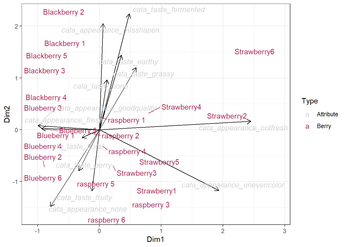
It’s the fact that the arrows need xend and yend instead of x and y like the text, as well as the fact that there are only arrows for half the data, that make it easier to give each geom its own data. There are simpler (and possibly better) ways to display the same information as this plot, which we’ll cover next.
If you ever find yourself tearing your hair out over a complicated plot, remember this section. Some resources you may find helpful for further reading and troubleshooting include:
- Kieran Healy’s “Data Visualization: a Practical Introduction”.
- The plotting section of R for Data Science.
- Hadley Wickham’s core reference textbook on ggplot2.
6.3 Better CA plots with ggplot2
We need to think about what we want to plot. The CA maps are scatterplots where each point is a sample (row variable) or attribute (column variable). These coordinates are in the list that the ca() function outputs, but in two separate matrices. We already learned how to combine them into one where the columns are axes and the rows are the variables from our initial dataset, with a column specifying whether each row is a sample or an attribute variable.
berry_ca_coords## # A tibble: 36 × 14
## Type Variable Dim1 Dim2 Dim3 Dim4 Dim5 Dim6 Dim7 Dim8
## <chr> <chr> <dbl> <dbl> <dbl> <dbl> <dbl> <dbl> <dbl> <dbl>
## 1 Berry Blackberr… -0.676 1.56 0.0289 -2.12 0.421 0.416 -0.0872 0.555
## 2 Berry Blackberr… -0.461 2.16 0.445 -0.676 -0.401 1.35 -0.144 0.318
## 3 Berry Blackberr… -1.03 1.03 0.589 -1.55 0.149 -0.154 -0.00916 0.173
## 4 Berry Blackberr… -0.476 0.738 -2.14 1.80 -1.05 0.604 1.12 1.62
## 5 Berry Blackberr… -0.738 1.55 -2.29 -0.377 -1.48 -0.653 -0.503 -0.956
## 6 Berry Blueberry… -0.942 -0.167 1.35 0.972 0.342 -0.709 0.276 0.509
## 7 Berry Blueberry… -0.891 -0.735 0.469 1.36 -0.0587 3.08 0.538 -1.17
## 8 Berry Blueberry… -0.693 0.308 0.498 0.267 1.45 -1.53 0.767 -0.176
## 9 Berry Blueberry… -1.06 -0.198 0.540 -0.601 1.45 -0.122 0.607 -0.266
## 10 Berry Blueberry… -0.904 0.0126 0.296 1.32 1.25 0.821 0.475 1.31
## # ℹ 26 more rows
## # ℹ 4 more variables: Dim9 <dbl>, Dim10 <dbl>, Dim11 <dbl>, Dim12 <dbl>This will get us pretty far.
berry_ca_coords %>%
  mutate(Variable = str_remove(Variable, "cata_")) %>%
  ggplot(aes(x = Dim1, y = Dim2, color = Type, label = Variable)) +
  geom_hline(color="black", yintercept = 0) +
  geom_vline(color="black", xintercept = 0) +
  geom_text() +
  theme_bw() +
  xlab("Dimension 1") +
  ylab("Dimension 2")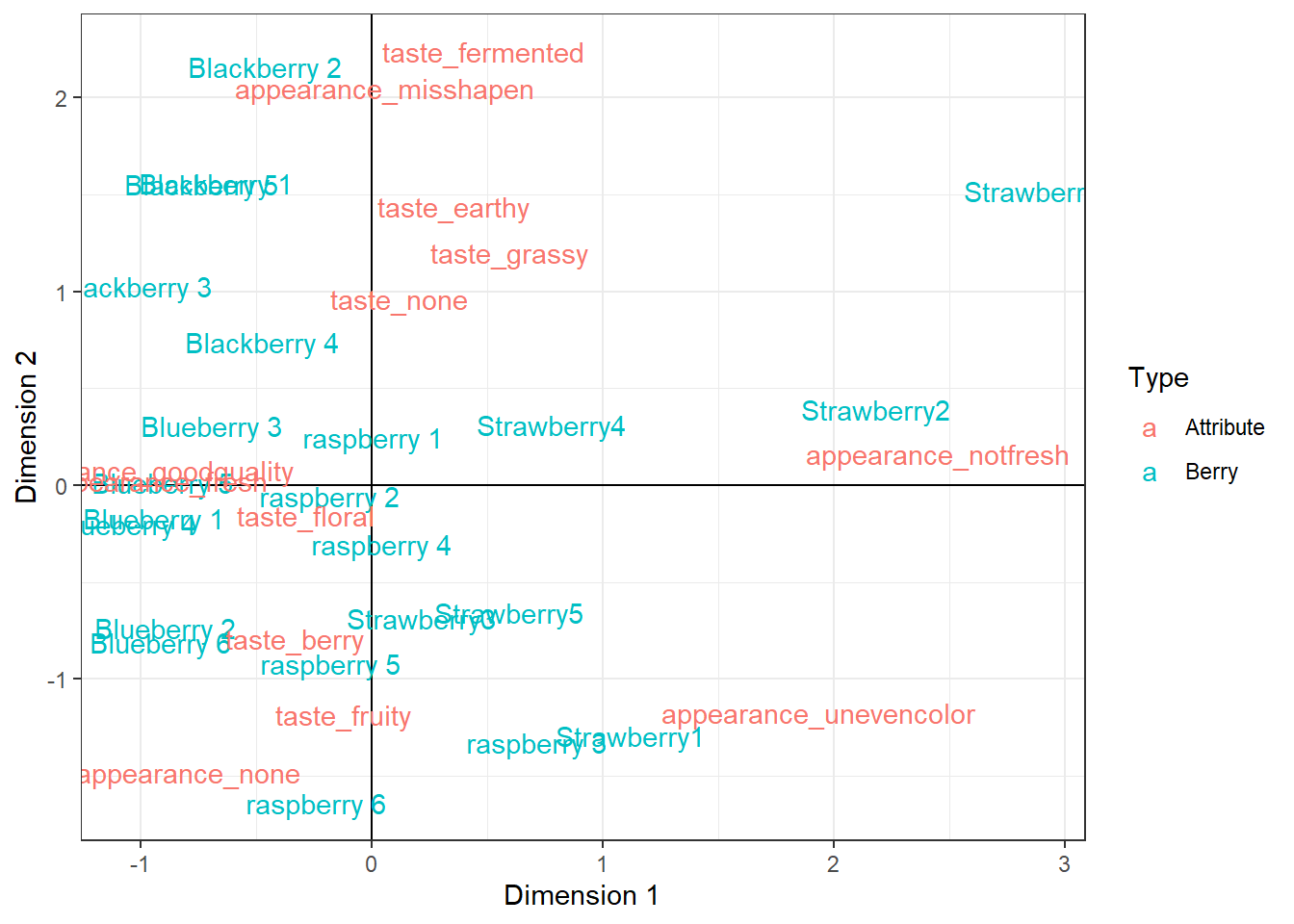
geom_text() is similar to geom_point(), but instead of having a point with a given shape, it places text on the plot which you can pull directly from your data using the label aesthetic. We can make this even more readable using geom_text_repel(), a very similar geom out of the ggrepel package:
berry_ca_coords %>%
  mutate(Variable = str_remove(Variable, "cata_")) %>%
  ggplot(aes(x = Dim1, y = Dim2, color = Type, label = Variable)) +
  geom_hline(color="black", yintercept = 0) +
  geom_vline(color="black", xintercept = 0) +
  geom_text_repel() +
  theme_bw() +
  xlab("Dimension 1") +
  ylab("Dimension 2")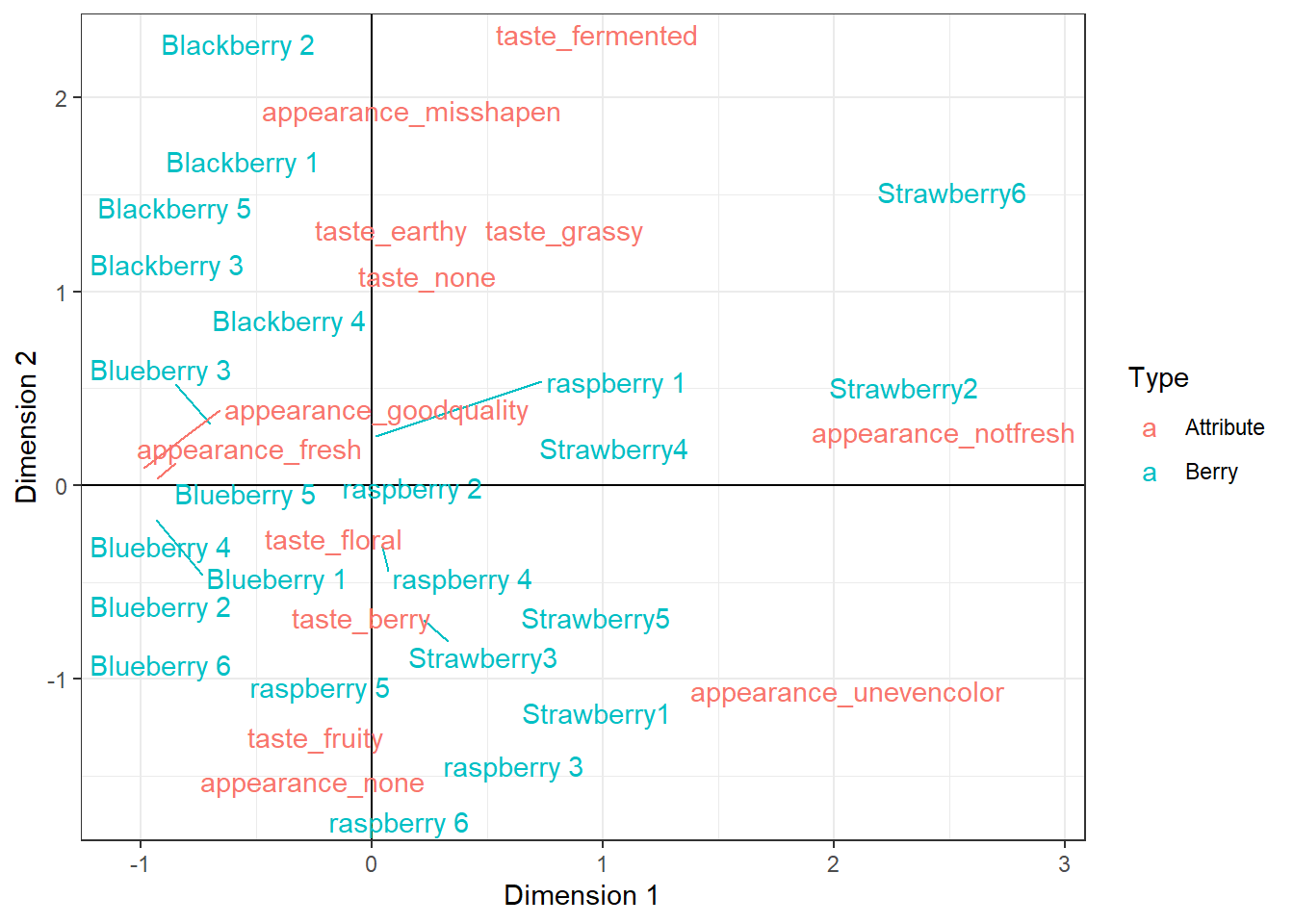
With a little bit of extra work, we can also add the % inertia to each dimension label, tweak the colors with color_scale_manual, and make the text a bit bigger.
berry_ca_res$sv %>%
  {str_c("Dimension ", 1:length(.), " (", round(100 * .^2 / sum(.^2), 1), "% Inertia)")} ->
  berry_cata_ca_dimnames

berry_ca_coords %>%
  mutate(Variable = str_remove(Variable, "cata_"),
         Variable = str_replace(Variable, "Strawberry", "Strawberry "),
         font = ifelse(Type == "Attribute", "italic", "plain")) %>%
  separate(Variable, c("Var_Major", "Var_Minor"), remove = FALSE) %>%
  ggplot(aes(x = Dim1, y = Dim2, fontface = font, color = Var_Major, label = Variable)) +
  geom_hline(color="black", yintercept = 0) +
  geom_vline(color="black", xintercept = 0) +
  geom_point() +
  geom_text_repel(size = 5) +
  theme_bw() +
  xlab(berry_cata_ca_dimnames[1]) +
  ylab(berry_cata_ca_dimnames[2]) +
  scale_color_manual(values = c("appearance" = "#bababa",
                                "taste" = "#7f7f7f",
                                "Blackberry" = "#2d0645",
                                "Blueberry" = "#3e17e8",
                                "raspberry" = "#7a1414",
                                "Strawberry" = "#f089cb"))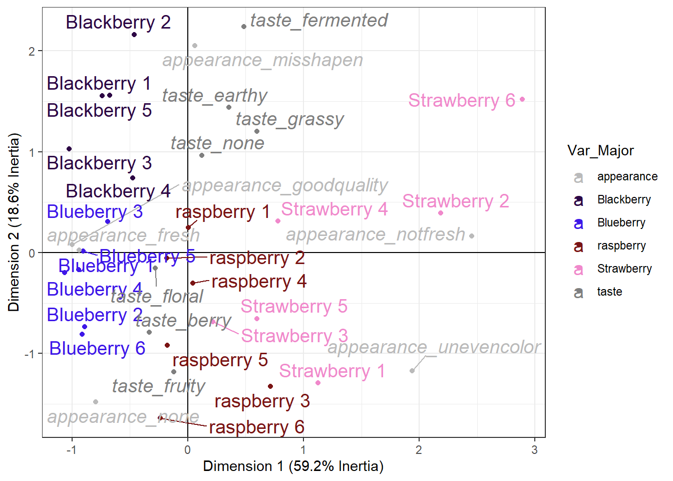
This plot still isn’t really what I’d call “publication ready”. A lot of the final tweaking will depend on the exact size you want, but regardless I’d probably continue adjusting the labels, zoom the plot out a bit, and consider only displaying CATA terms with a high enough berry_ca_res$colinertia so the plot was a bit less cluttered.
You can tweak forever. And I’d encourage you to go ahead and try to do whatever you can think of, right now, to make this graph more readable!
For now, this is the culmination of your new data-wrangling, analysis, and graphing skills. We can see which berries are more fresh-tasting and have no notable appearance attributes (blueberries and blackberries), which berries are the worst-looking (strawberries 2 and 6), and we could identify berries anywhere along our roughly earthy/fermented to fruity/berry Dimension 2 (from blackberry 2 to raspberries 3 and 6).
This is also the same set of skills that you’ll need for PCA, MDS, DISTATIS, ANOVA, text analysis, and any other computational or statistical task in R.