4 Using ggplot with Other Packages
As you might have noticed, we had you download more packages than just ggplot2 for this tutorial. ggplot2 is a framework and will help you make many standard plots, but it can’t do everything. Or, sometimes, you may not want to use it to do everything yourself.
Packages meant to work with ggplot2 to more easily make specific kinds of visualizations are also called ggplot extensions. The four most common kinds of ggplot extensions are:
- Packages that add
geom_*()sorstat_*()s for new kinds of plots - Packages that add
theme_*()s andscale_*()s for specific color or style needs - Packages that make
ggplotobjects, so you never writeggplot()yourself - Packages that combine multiple plots in various ways
You can view many of these extensions on the tidyverse website (where you’ll also see many examples that fall into multiple of these categories or don’t fit into the categories here at all).
4.1 Data for the rest of the tutorial
In order to dive into the actual visualization parts of a data analysis workflow, we’re going to skip over most of the intensive data wrangling from here on out. In addition to the existing raw_berry_data and raw_cider_data we’ve read in previously with read_csv(), let’s use load("data/cleaned-data.RData") to pull in 6 tibbles of data at various intermediate stages.
If you’re curious, we’ve included all of the code we used to wrangle these tibbles in the script datawrangling.R, but for now, let’s just load them in and use the FactoMineR package to get some product coordinates.
load("data/cleaned-data.RData")

cider_contingency %>%
  FactoMineR::CA(graph = FALSE) -> ca_cider

berry_mfa_summary %>%
  FactoMineR::MFA(group = c(sum(str_detect(colnames(berry_mfa_summary), "^cata_")),
                            sum(str_detect(colnames(berry_mfa_summary), "^liking_"))),
                  type = c("f","s"), graph = FALSE,
                  name.group = c("CATA","Liking")) -> berry_mfa_res

save(ca_cider,
     berry_mfa_res,
     file = "data/svd-results.RData")
4.2 New geom_*()s and stat_*()s
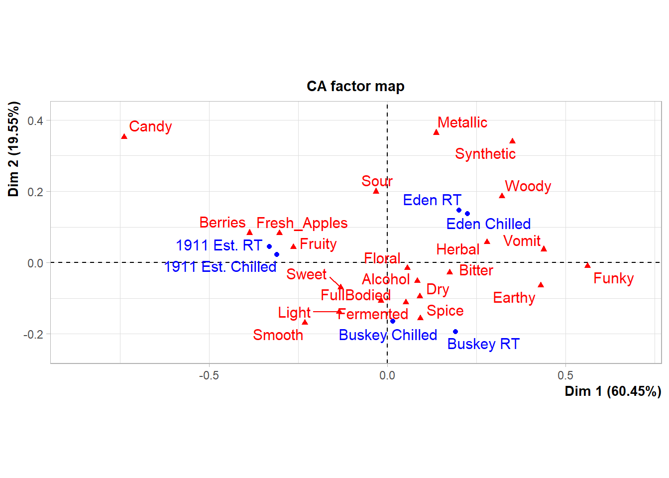
If you want to label each individual point in the plotting area using text, rather than some symbol or color that indicates the legend off to the side, you can do this using the base ggplot2 functions geom_text() and geom_label():
#Let's use the cider CA example from before.
#We can make our own plots from the coordinates.
ca_cider$col$coord %>%
  as_tibble(rownames = "Attribute") %>%
  ggplot(aes(x = `Dim 1`, y = `Dim 2`, label = Attribute)) +
  theme_bw() -> ca_cider_termplot

ca_cider_termplot +
  geom_text()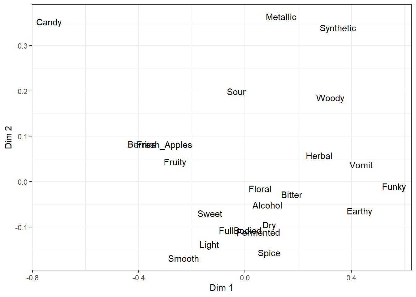
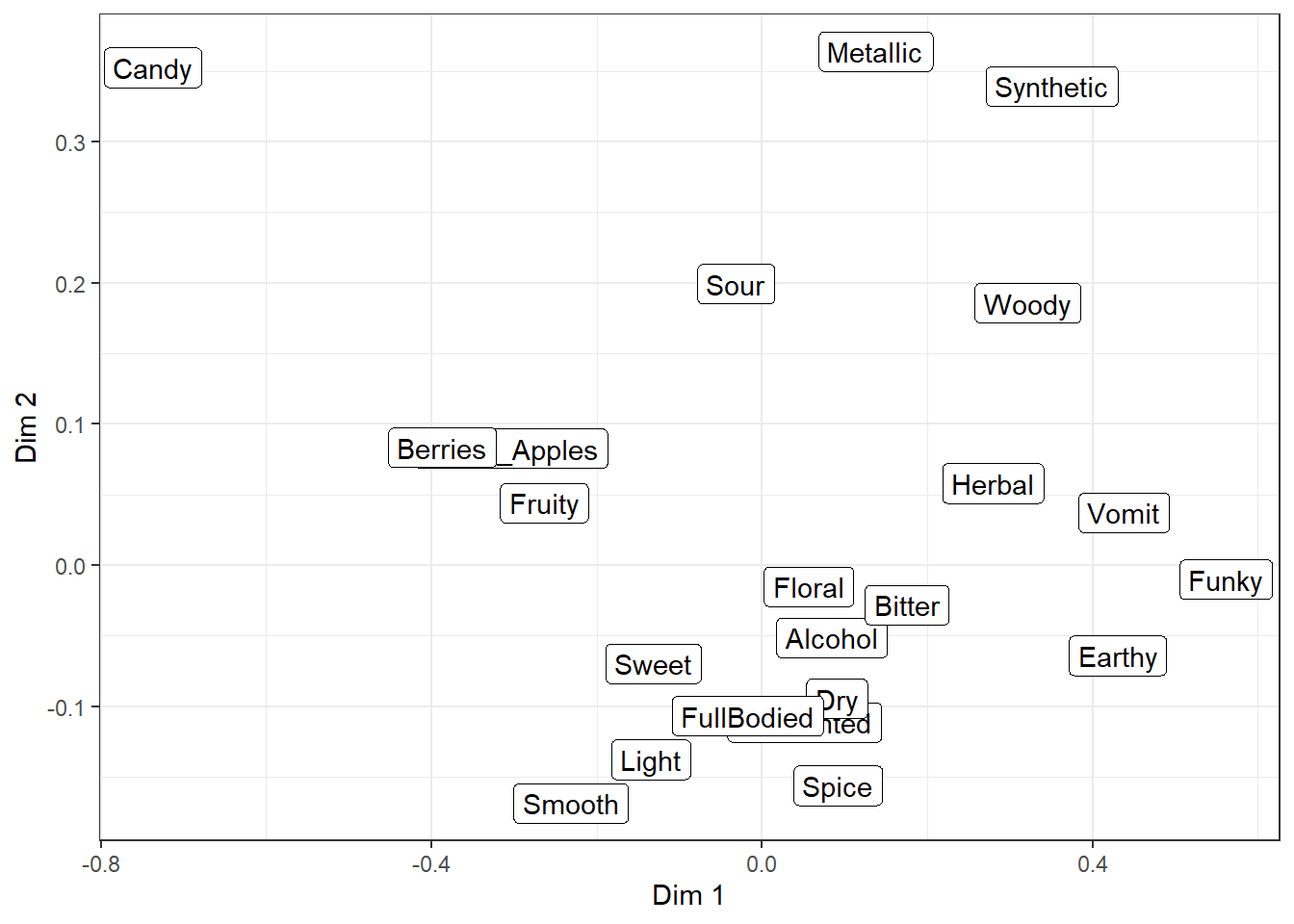
But, as you can see, the text starts to overlap itself quickly even with only a small handful of attributes. The extension I personally use most often, to make crowded plots like this more readable, is the package ggrepel, which adds new geom_text_repel() and geom_label_repel().
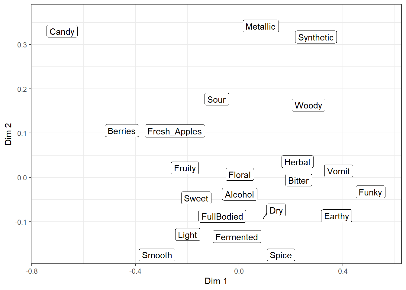
They’re almost identical to the normal text and label geom_*()s, but they use an iterative algorithm to push each piece of text away from the other text and unrelated points or geom_()s, while being pulled towards the point being labeled. It is not deterministic, so it will be slightly different each time you run the code (try it now!) unless you use set.seed() first or set seed = *** when adding geom_*_repel().
Even with a set seed, changing the plot size or adding geom_*()s to the plot will also slightly change the locations of the labels, so if you’re going to try and find a seed that works well for your data, you should be checking it on your final exported plot at the publication resolution (we’ll talk about that next chapter).
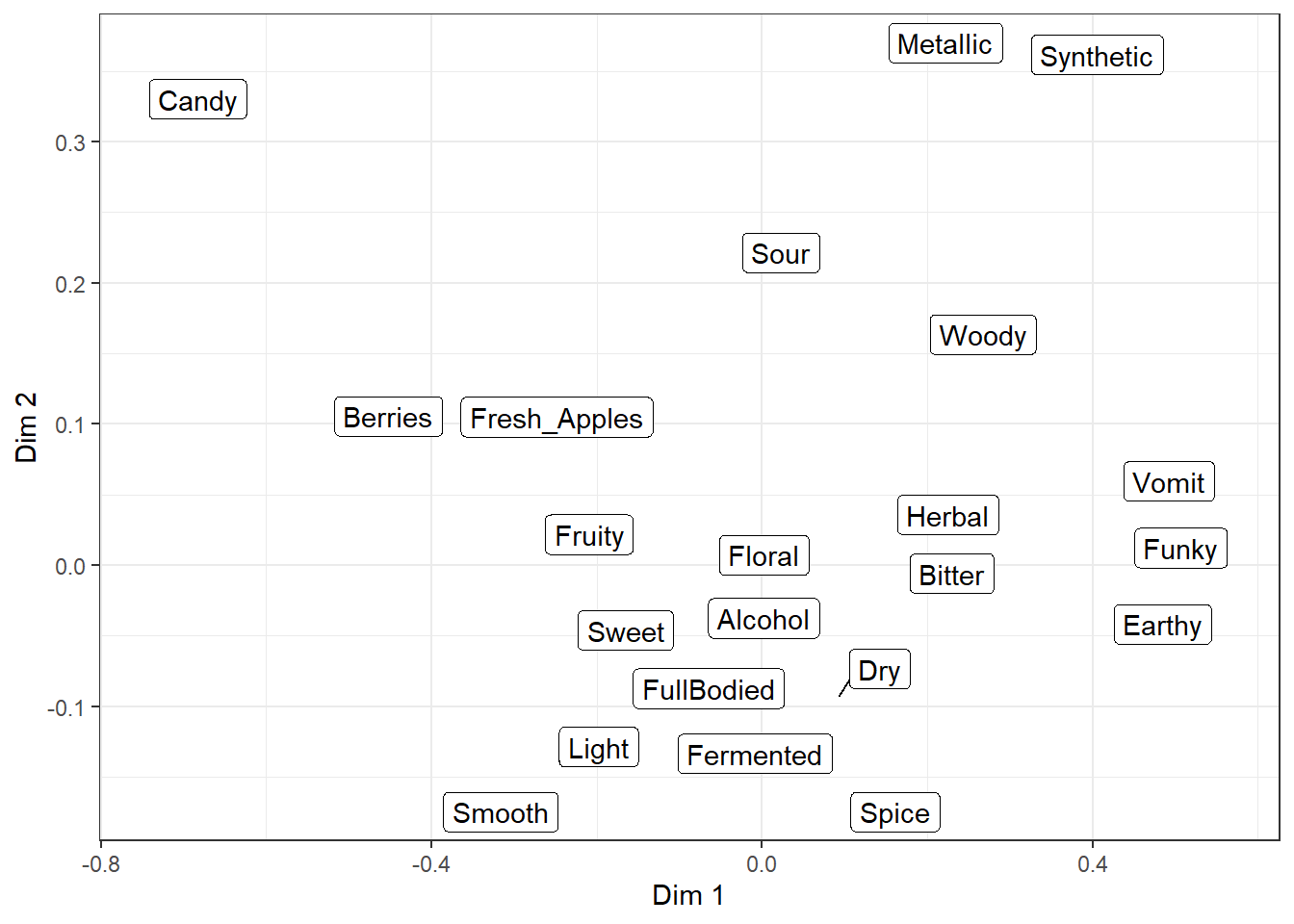
There are many settings you can play with to adjust these forces, how far a label has to move for a line to show up, whether any labels are left off in dense areas, and how long it tries to find a solution. And, randomly, the ability to give each letter-shape a border in a different color, which seems to be totally undocumented in the help files. It can be useful if there are other, multi-colored geom_*()s in the background.
raw_cider_data %>%
  mutate(Product = str_c(Sample_Name, Temperature, sep = " ")) %>%
  group_by(Product) %>%
  summarize(Liking = mean(Liking)) %>%
  left_join(ca_cider$row$coord %>%
              as_tibble(rownames = "Product")) %>%
  rename_with(~ str_replace_all(.x, " ", ".")) -> ca_cider_productcoord

#This is NOT a statistically sound preference model, this is just for demonstration
ca_cider_prefmod <- lm(Liking ~ Dim.1 * Dim.2, data = ca_cider_productcoord)
expand.grid(Dim.1 = seq(min(ca_cider$col$coord[, "Dim 1"]) - 0.1,
                    max(ca_cider$col$coord[, "Dim 1"]) + 0.1,
                    by = 0.01),
            Dim.2 = seq(min(ca_cider$col$coord[, "Dim 2"]) - 0.1,
                    max(ca_cider$col$coord[, "Dim 2"]) + 0.1,
                    by = 0.01)) %>%
  mutate(., Liking = predict(ca_cider_prefmod, newdata = .)) -> ca_cider_prefinterp

ca_cider_termplot +
  geom_contour_filled(aes(x = Dim.1, y = Dim.2, z = Liking, fill = after_stat(level)),
                  inherit.aes = FALSE,
                  data = ca_cider_prefinterp) +
  scale_x_continuous(expand = c(0, 0)) +
  scale_y_continuous(expand = c(0, 0)) +
  ggrepel::geom_text_repel(size = 6, color = "white", bg.color = "grey7")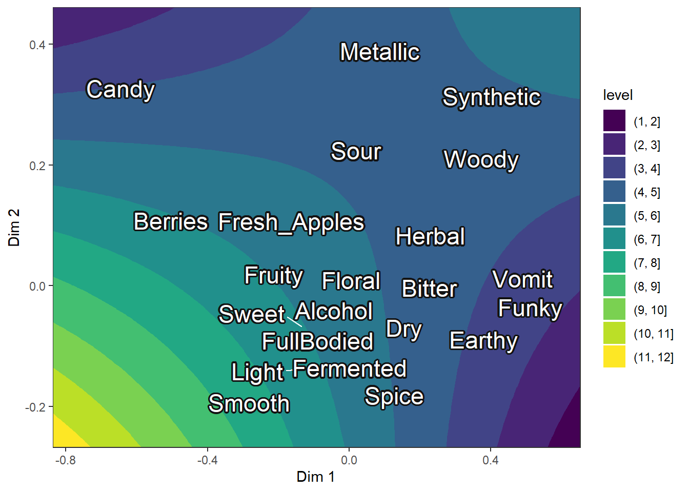
Another useful tool for visualizing any ordinal/binned data (e.g., the 9-point hedonic scale) at scale is the geom_beeswarm() and geom_quasirandom() from the ggbeeswarm package, which are similar to geom_jitter() but intended for looking at a single numeric variable at a time, possibly across multiple categories.
They limit the jitter to a single direction and ensure that no points are overlapping (or, in the case of geom_quasirandom(), that there’s a uniform amount of overlap) so you can get a more accurate picture of the density, but take up less space than many faceted geom_histogram()s (at least for the same amount of fine-tuning).
#The jitter plot is actually not very helpful with this many points
berry_long_liking %>%
  ggplot(aes(x = Scale, y = Liking, color = Scale)) +
  geom_jitter() +
  facet_wrap(~ Attribute) +
  theme_bw()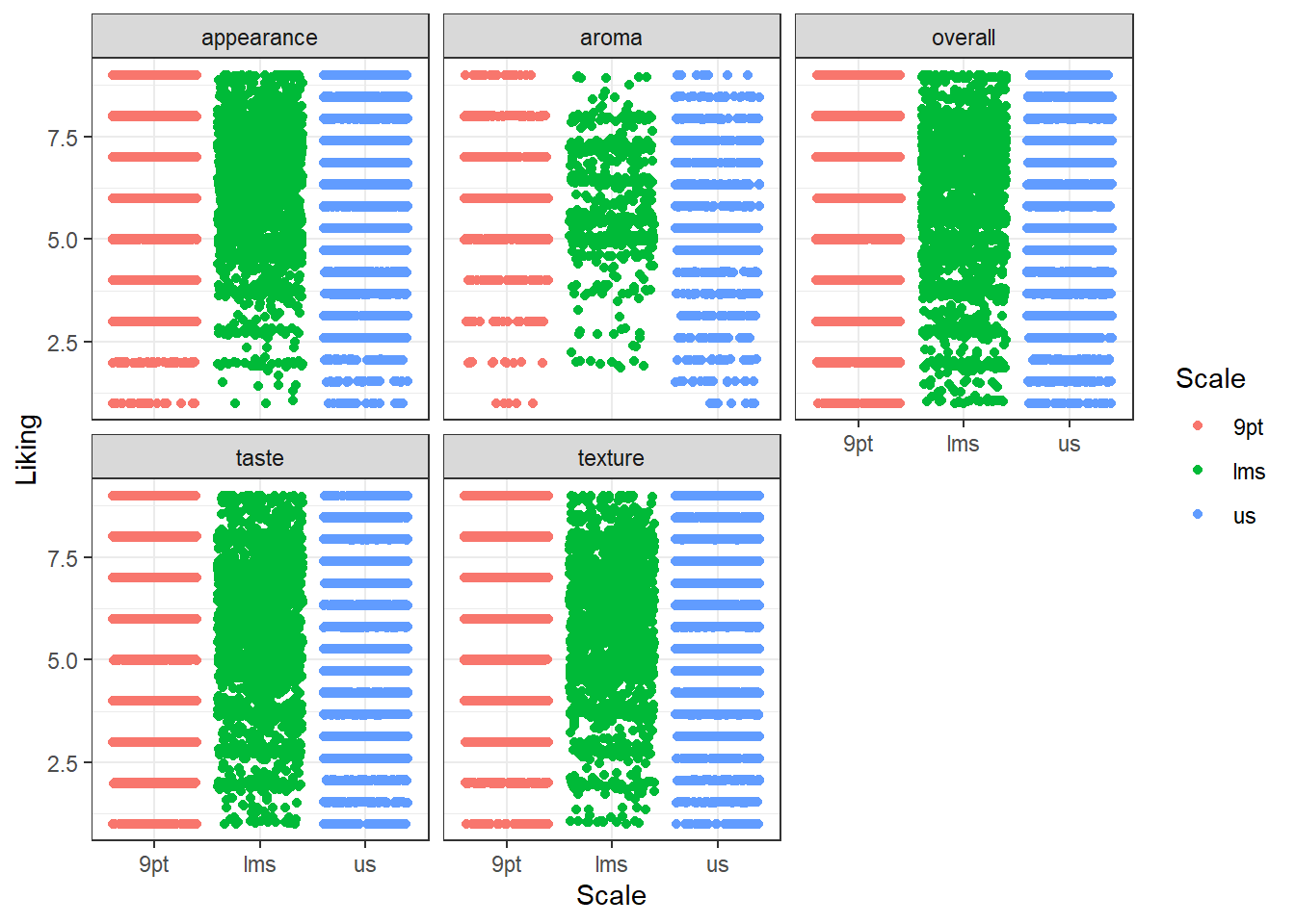
#geom_beeswarm() will also have the same problem, but geom_quasirandom()
#visualizes the density at each "bin" without us having to specify bins.
#So these are easy to compare
berry_long_liking %>%
  ggplot(aes(x = Scale, y = Liking, color = Scale)) +
  ggbeeswarm::geom_quasirandom() +
  facet_wrap(~ Attribute) +
  theme_bw()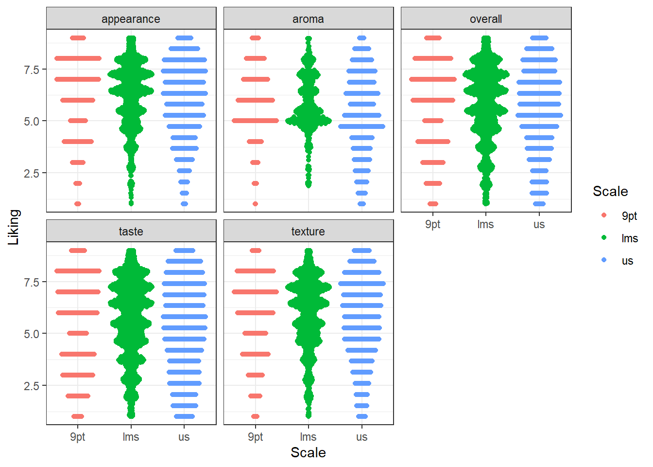
If you want to easily add circles and ellipses to a plot (say, the unit circle or a confidence ellipse), you’ll probably want to install the ggforce package and use geom_circle() or geom_ellipse(), respectively.
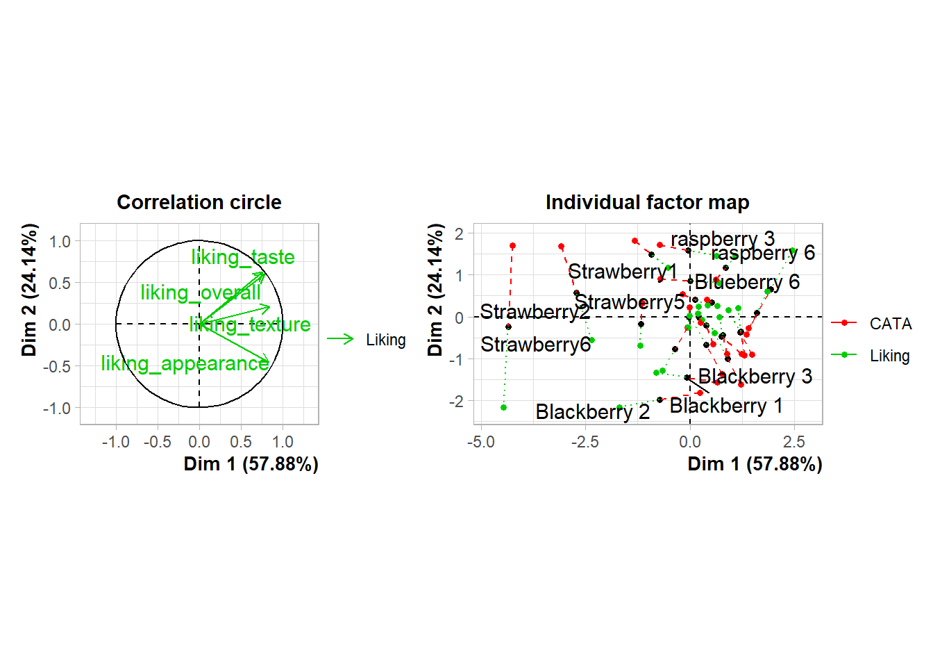
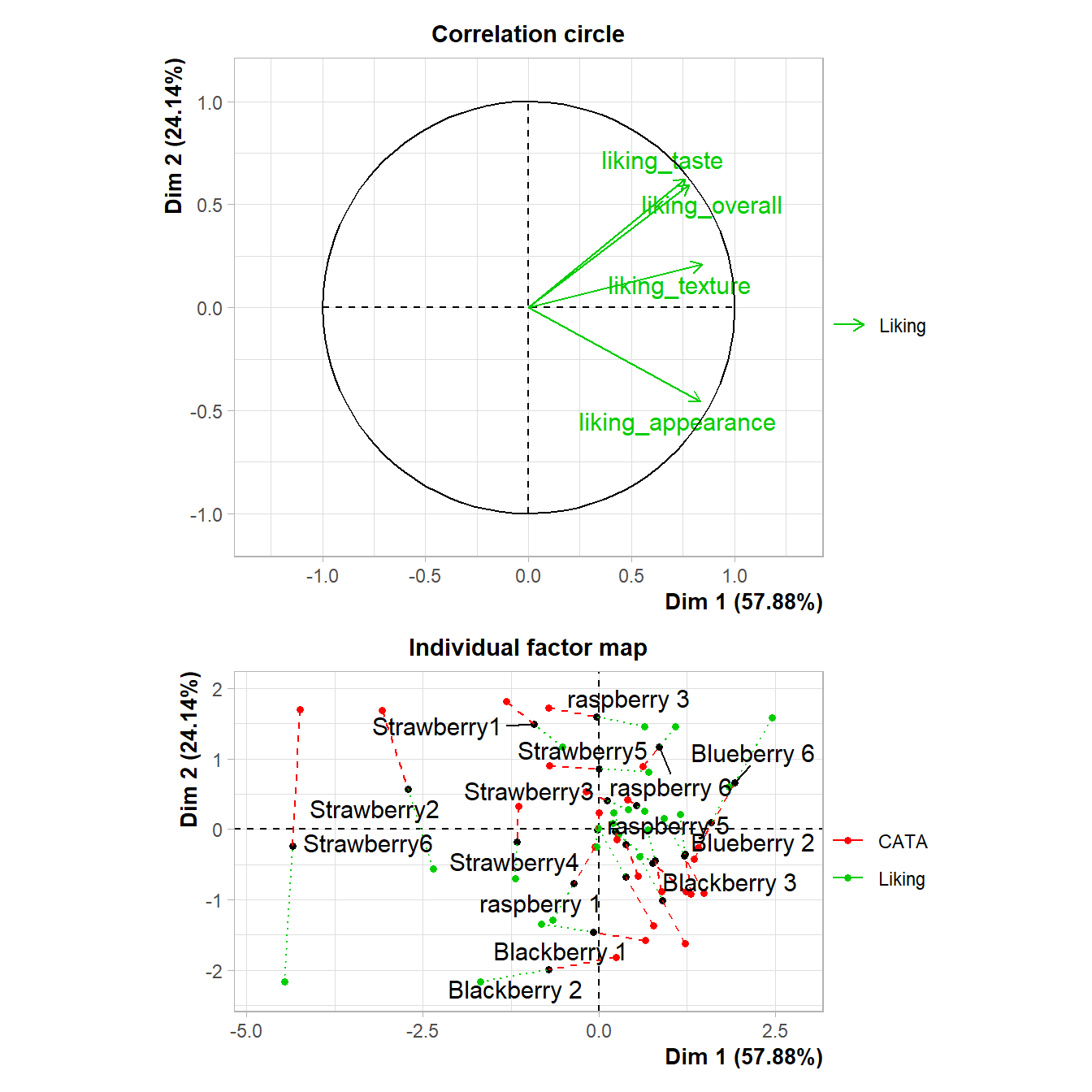
berry_mfa_res$quanti.var$coord %>%
  as_tibble(rownames = "Modality") %>%
  ggplot() +
  geom_segment(aes(x = 0, y = 0, xend = Dim.1, yend = Dim.2), arrow = arrow()) +
  ggforce::geom_circle(aes(x0 = 0, y0 = 0, r = 1), color = "blue") +
  ggrepel::geom_text_repel(aes(x = Dim.1, y = Dim.2, label = Modality)) +
  theme_bw() +
  theme(aspect.ratio = 1)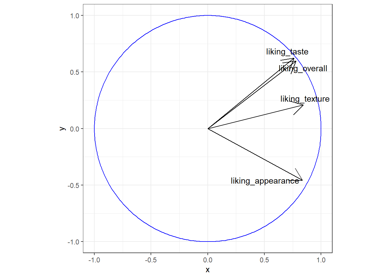
4.3 New theme_*()s and scale_*()s
Most of the additional geom_*()s in ggplot2 extensions involve some sort of calculation, so the confidence that you’re using someone else’s algorithm that’s (hopefully!) been double-checked is a real benefit. You’ve already seen how to change the way your plots look with theme() one argument at a time, and how to set scale_*_manual() if you have the exact colors or color range that you want.
So there’s nothing these prettying-up packages will do that you can’t do yourself, but there are a huge number of ggplot2 extensions that include some version of a no-gridline minimal theme for convenience. Such as:
berry_long_liking %>%
  ggplot(aes(x = Scale, y = Liking, color = Scale)) +
  ggbeeswarm::geom_quasirandom() +
  facet_wrap(~ Attribute) +
  cowplot::theme_minimal_hgrid()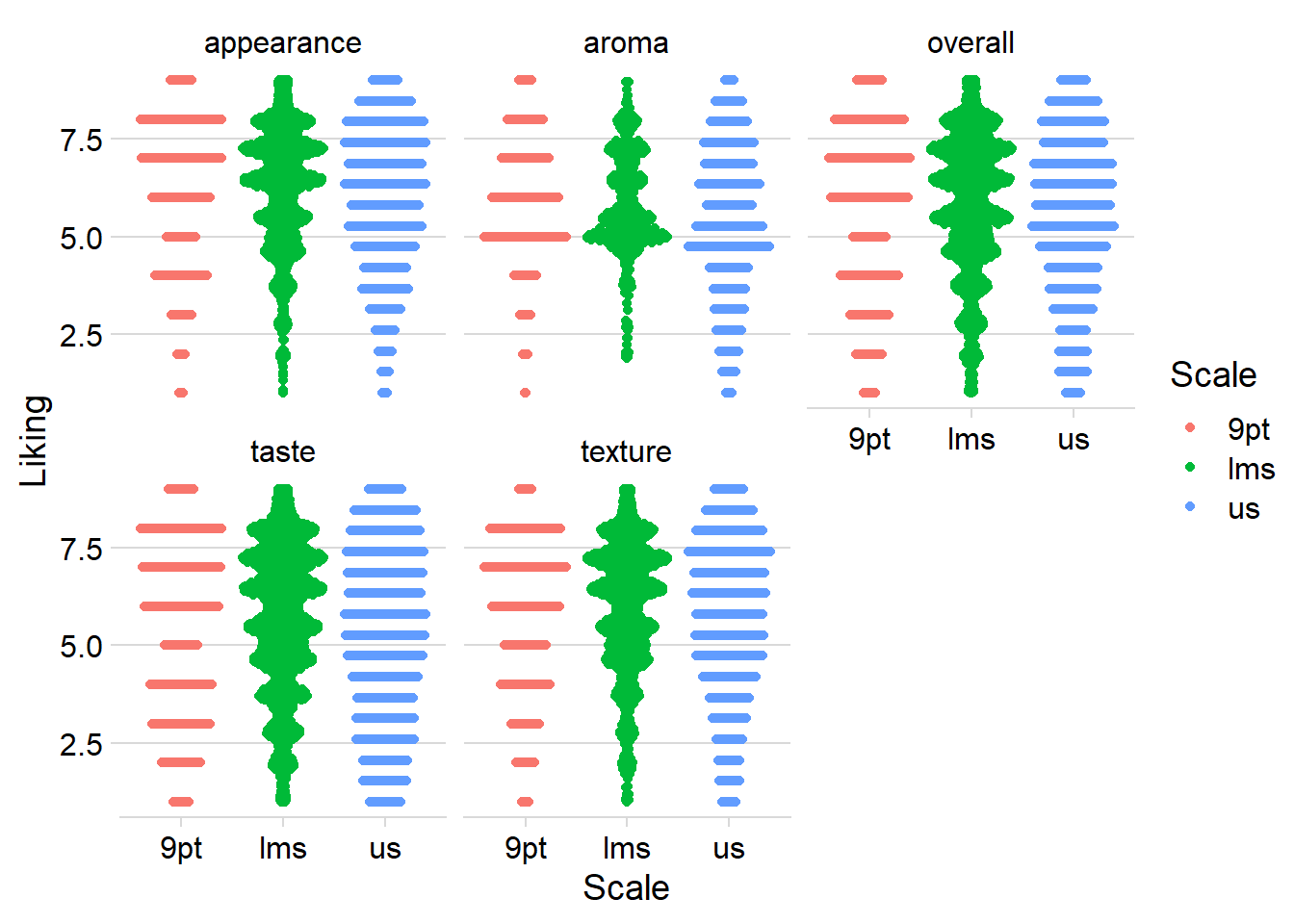
Packages that added scale_*()s used to be one of the most common kinds of ggplot extensions (because, as you’ll notice, the above figure with the default color scale is not red-green colorblind friendly), but the most popular scales now come with ggplot2 itself.
RColorBrewer’s colorblind- and printer-friendly palettes for categorical data are now available in ggplot2::scale_*_brewer_*(), and you’ve already seen us use the viridis color palettes in ggplot2::scale_*_viridis_*(). The viridis color scales can be used for categorical data, if you use the _d() versions, but they were designed for ordinal and binned data, since some colors will seem more related than others. See Chapter 4 and Chapter 19 of Claus O. Wilke’s book Fundamentals of Data Visualization.
4.4 Modifying ggplot()s made by other packages
So far in this chapter, we’ve been making all of the plots with a call to ggplot() and then adding on geoms, themes, labels, scales, and facets with +. But we’ve also been able to save our plots to variables partway through and then keep adding things to the saved plots. This is an incredibly useful difference from the way plots work in base R.
Some packages utilize ggplot2 by making a whole plot for you with their own internal call to ggplot(), which means that you can treat it like any other ggplot for the sake of customizing. Most packages which can save a whole plot to a variable or output several plots in a list use ggplot() to do so.
#FactoMineR uses ggplot for its internal plotting,
#Which is why we can assign the output to a variable
#and not see the plot right away
#(although the CA() function will also display several plots by default)
cider_contingency %>%
  FactoMineR::CA(graph = FALSE) %>%
  FactoMineR::plot.CA() -> ca_cider_biplot_facto

#The ca package, meanwhile, uses base plotting.
#You can tell because it prints this plot immediately.
cider_contingency %>%
  ca::ca() %>%
  ca::plot.ca() -> ca_cider_biplot_green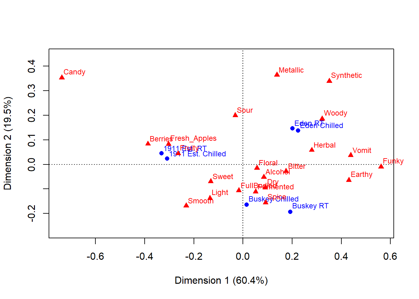
You can see that the last code chunk only output one plot right away, but we can confirm our suspicions with the base R class() function.
## [1] "gg" "ggplot"## [1] "gg" "ggplot"## [1] "list"## $rows
## Dim1 Dim2
## 1911 Est. Chilled -0.30922746 0.02323046
## 1911 Est. RT -0.33096663 0.04492088
## Buskey Chilled 0.01508206 -0.16463573
## Buskey RT 0.19222871 -0.19341072
## Eden Chilled 0.22460300 0.13702229
## Eden RT 0.20122093 0.14661009
##
## $cols
## Dim1 Dim2
## Fresh_Apples -0.30305451 0.08260444
## Fermented 0.05136995 -0.11123214
## Herbal 0.27953814 0.05798442
## Dry 0.09068713 -0.09458987
## Spice 0.09194648 -0.15607561
## Fruity -0.26360780 0.04401256
## Smooth -0.23141023 -0.16865980
## Alcohol 0.08456228 -0.05135981
## Light -0.13444990 -0.13768159
## Sweet -0.13152453 -0.06963735
## Woody 0.32164765 0.18574435
## Berries -0.38694032 0.08324652
## Sour -0.03153644 0.19917586
## Funky 0.56153039 -0.01014260
## FullBodied -0.01727177 -0.10673686
## Metallic 0.13770506 0.36391448
## Floral 0.05665116 -0.01517803
## Candy -0.73752932 0.35245085
## Bitter 0.17535866 -0.02812715
## Vomit 0.43823154 0.03719609
## Earthy 0.43043925 -0.06405187
## Synthetic 0.35094003 0.33924051What this means is that we can look at the FactoMineR-made plot we’ve saved to ca_cider_biplot_facto:
And we can still change up many of the elements by adding additional elements, although you’re likely to get some weird warning messages and some silent errors. (The ggrepel error message is actually just because there are too many geom_text_repel() labels close-together in a small plots, because expanding xlim() crowds everything in the center of the plot.)
ca_cider_biplot_facto +
  theme(panel.grid = element_blank(), # Removes the axis lines
        plot.title = element_blank()) + # Removes the title
  xlim(-1,1) + # Extends the x limits, with a warning
  scale_color_brewer(type = "qual", palette = "Dark2")
## Scale for x is already present.
## Adding another scale for x, which will replace the existing scale.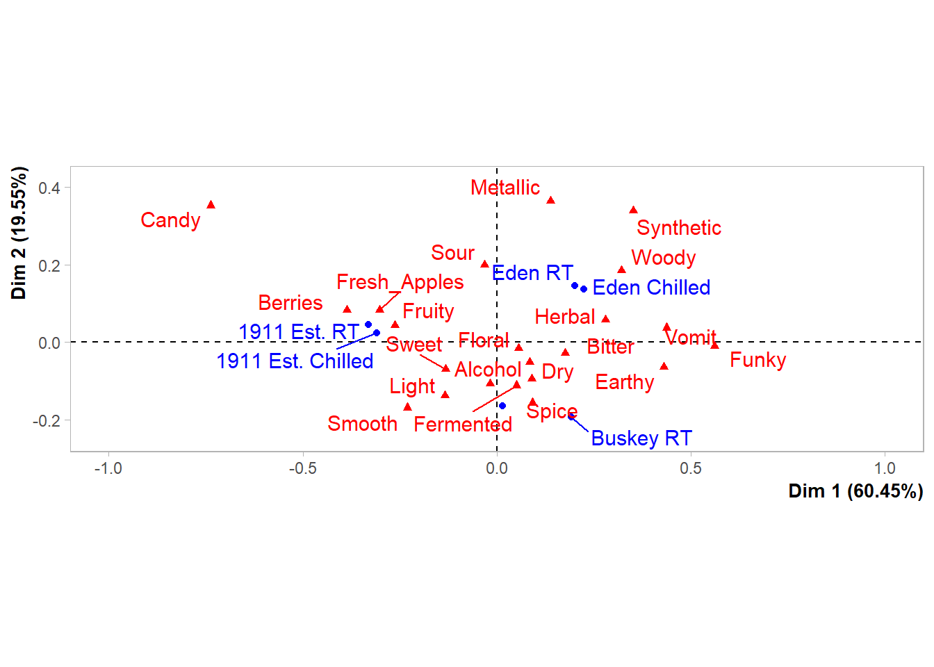
You can’t just + scale_color_*() to a FactoMineR plot, because the ggplot already has a non-default color scheme and adding a second color scale does nothing. If you look at the help file for ?FactoMineR::plot.CA, you can set several styling parameters when you’re making the plot, and you can remake it as many times as you need, but doing so does have significantly less flexibility than the approach to plotting we’ve outlined in this workshop.
We also can’t go back and adjust the parameters passed to geom_text_repel() after the fact, even though we can tell from the warning messages that that’s the package being used to put the attribute and product names onto the biplot.
It will almost always be possible to add more geom_*()s to plots made by other packages, as long as you don’t mind them being added on top of any existing elements in the plot.
liking_arrow <- data.frame(x1 = 0, y1 = 0, x2 = -0.4, y2 = -0.1, text = "Liking")

ca_cider_biplot_facto +
  geom_segment(aes(x= x1, y = y1, xend = x2, yend = y2), color = "orange",
               arrow = arrow(length = unit(0.03, "npc")), linewidth = 1,
               data = liking_arrow) +
  geom_text(aes(x = x2, y = y2, label = text), color = "orange",
            hjust = "outward", vjust = "outward", fontface = "italic",
            data = liking_arrow)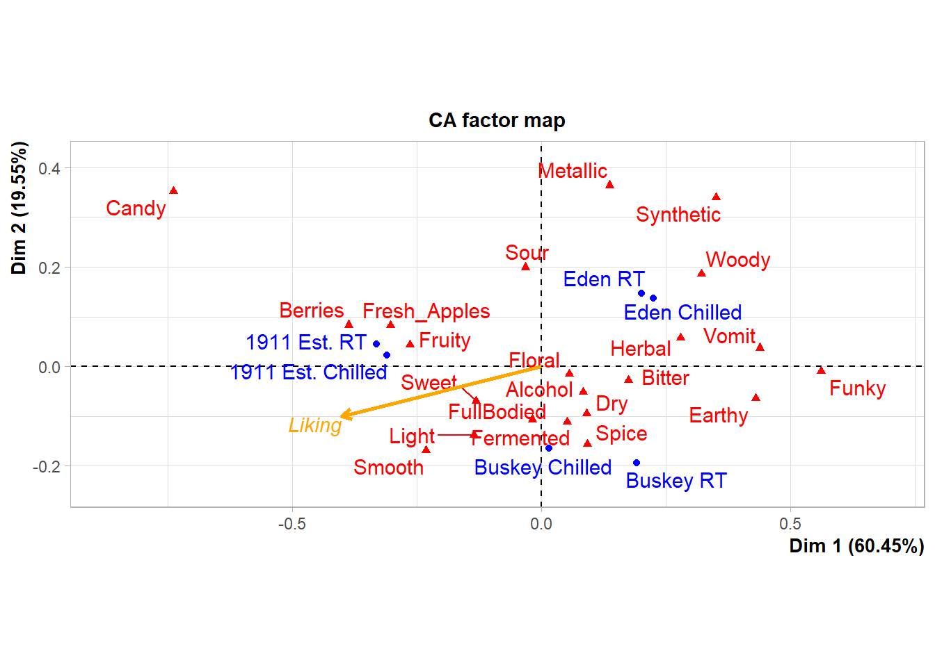
If you desperately need to change a scale or reorder geom_*()s from an existing ggplot in a hurry, look into the gginnards package.
4.5 Combining Plots
You’ve already seen how to facet_*() plots to view “small multiple” plots side-by side:
raw_cider_data %>%
  pivot_longer(Fresh_Apples:Synthetic) %>%
  group_by(Sample_Name, Temperature, name) %>%
  summarize(total = sum(value)) %>%
  ggplot(aes(x = interaction(Sample_Name, Temperature), y = total)) +
  geom_col(aes(fill = Sample_Name)) +
  scale_fill_manual(values = wesanderson::wes_palettes$FantasticFox1) +
  coord_flip() +
  labs(x = NULL, y = NULL, fill = NULL) +
  theme_bw() +
  theme(legend.position = "top",
        panel.grid = element_blank()) -> cider_count_plot

cider_count_plot +
  facet_wrap(~name, ncol = 6)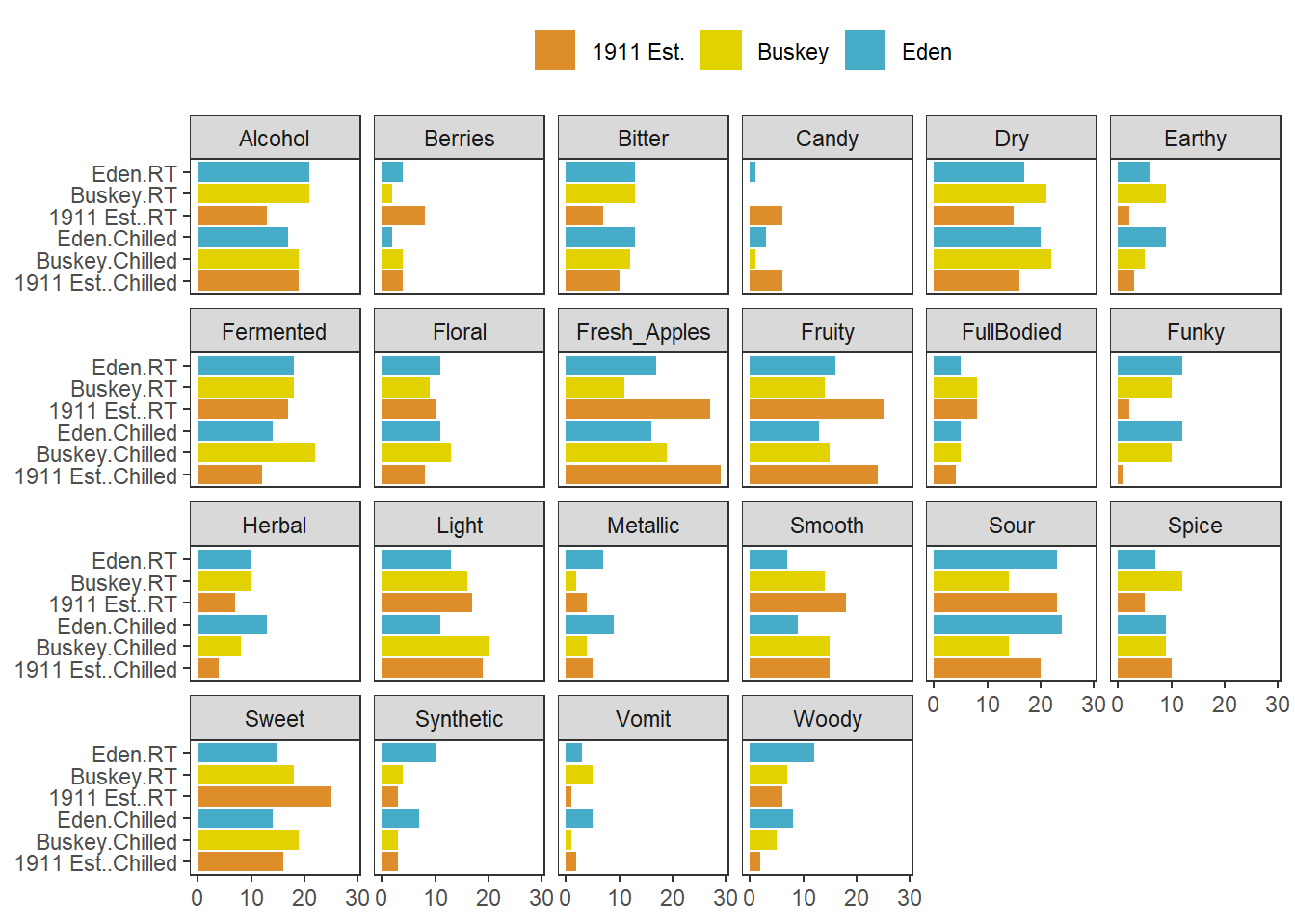
This works very well whenever you have multiple plots using the same geom_*()s that you want to show on the same axes, and you can even adjust the axis limits from facet to facet using scales = "free*":
cider_count_plot +
  facet_wrap(~name, ncol = 6,
             scales = "free_x") # Each plot now has a different x-axis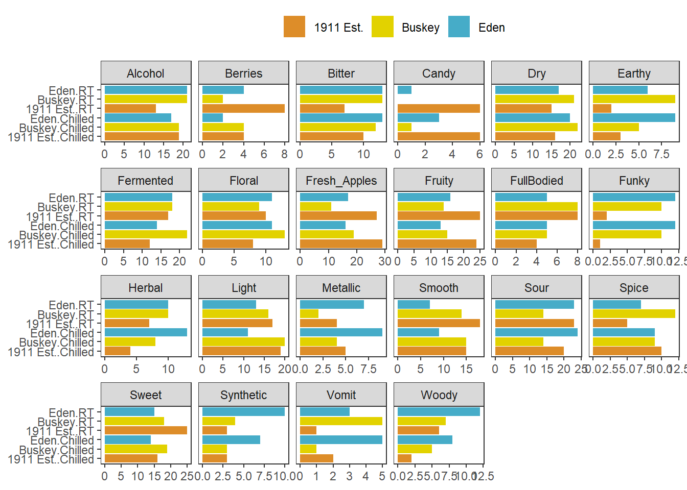
Not that we’d argue you should here. Also, take note that the x in free_x refers to the horizontal axis in the final plot, after the coord_flip(), and not the x aesthetic we set in the ggplot() call.
But if you have different plot types entirely (different data sources, different geom_()s, or different categorical axes) that you want to place side-by-side, say a loading plot and the product map resulting from a PCA or MFA, you’re going to need something to paste together multiple ggplot_()s.
The easiest way to do this is using patchwork, which will work on ggplots you’ve made yourself or with ones made by packages like FactoMineR. When you have patchwork loaded, the + operator will put two plots side-by-side:
And the / operator will arrange two plots vertically:
The advantage of doing this with a package like patchwork, rather than saving separate images, is that it aligns all of the plot areas precisely and that they will more easily move or rearrange certain plot elements like legends and axis labels.
plot(berry_mfa_res, choix = "var") + plot(berry_mfa_res, partial = "all") +
  plot_layout(guides = "collect") &
  theme(plot.title = element_blank(),
        legend.position = "bottom")
The & operator lets you add elements like themes or annotations to all of the plots you’ve combined together. plot_layout() is a patchwork function that lets you set relative plot sizes, decide how to arrange more than 2 plots, and move legends:
plot(berry_mfa_res, partial = "all") +
  (plot(berry_mfa_res, choix = "var") +
  plot(berry_mfa_res, choix = "freq", invisible = "ind")) +
  plot_layout(guides = "collect", ncol = 1, widths = 2) &
  theme(plot.title = element_blank(),
        axis.title = element_blank(),
        legend.position = "bottom")
If you want to put images anywhere on a visualization, you’re struggling to make a complex arrangement with patchwork, or you have an R list structure containing multiple plots (say, the result of a for loop, *apply(), or nest() call), then cowplot is another option:
berry_mfa_res$separate.analyses %>%
  lapply(function(x) {
    x$ind$coord %>%
      as_tibble(rownames = "Berry") %>%
      ggplot(aes(x = Dim.1, y = Dim.2)) +
      geom_point()
  }) %>%
  cowplot::plot_grid(plotlist = ., labels = names(.))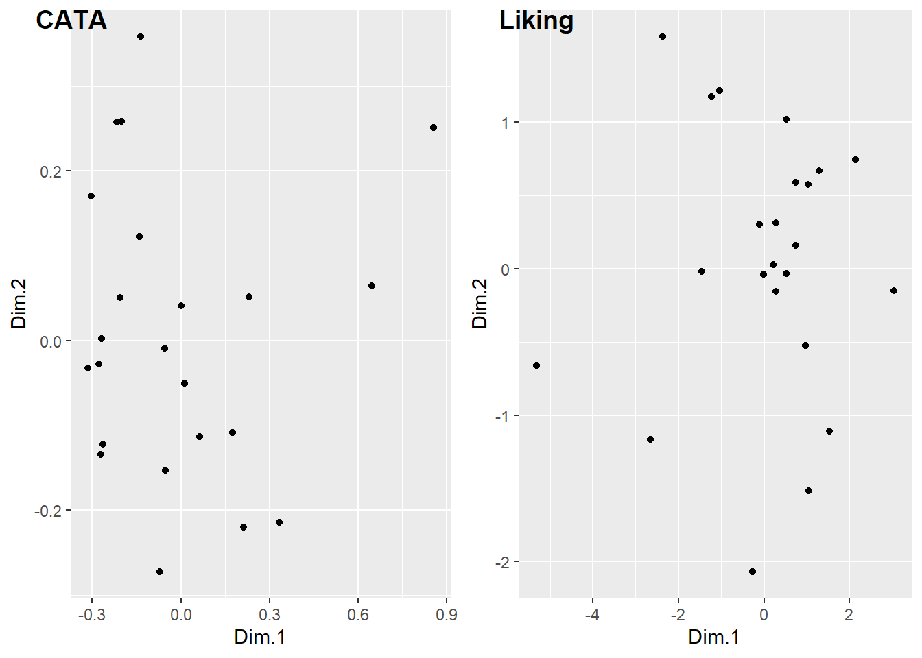
#You can also pipe your list into patchwork::wrap_plots()
#if you have the latest version of patchwork.
#It's a fairly new package, so it gains big new features very often.
Both of these packages can also add letters and other labels to each plot:
plot(berry_mfa_res, choix = "var") + plot(berry_mfa_res, partial = "all") +
  plot_layout(guides = "collect") +
  plot_annotation(tag_levels = 'A') &
  theme(plot.title = element_blank(),
        legend.position = "bottom")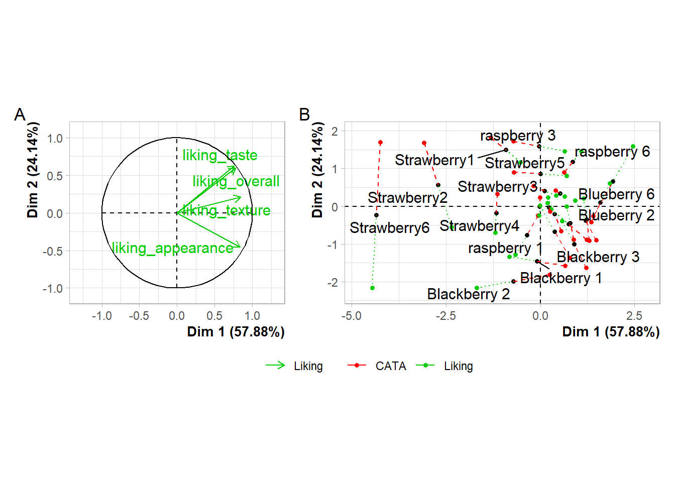
cowplot::plot_grid(plot(berry_mfa_res, choix = "var"),
                   plot(berry_mfa_res, partial = "all"),
                   labels = "AUTO")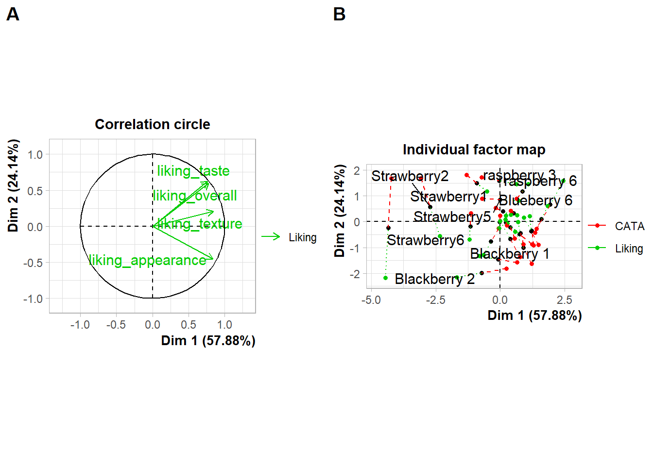
#Cowplot doesn't have a way to combine or move legends.
#You'd have to move the legends *before* using plot_grid()
If you need to move or realign the labels so they’re not overlapping anything, in patchwork you can add theme(plot.tag.position = c(X, Y)) to individual plots with + or to the whole grouping of plots with &. The cowplot::plot_grid() function has arguments labels_x and labels_y, which let you adjust the distance from the bottom left hand corner of the figure.
plot(berry_mfa_res, choix = "var") + theme(plot.tag.position = c(0.2, 0.95)) +
  plot(berry_mfa_res, partial = "all") + theme(plot.tag.position = c(0.12, 0.95)) +
  plot_layout(guides = "collect") +
  plot_annotation(tag_levels = 'A') &
  theme(plot.title = element_blank(),
        legend.position = "bottom")
cowplot::plot_grid(plot(berry_mfa_res, choix = "var"),
                   plot(berry_mfa_res, partial = "all"),
                   labels = "AUTO",
                   label_y = 0.8)
You can also use any image editing, publishing, or graphics software to manually combine, arrange, and label plots, but if you need to make changes to a plot later then doing your layout in R will mean you just have to run the lightly-updated code again to re-export a fully formatted multi-part figure, even if the plot dimensions change.
4.6 Finding New Packages
This isn’t all the functionality of any of these packages, and these aren’t the only packages that add new features to ggplot2.
If you’re trying to figure out how to create a type of plot you’ve never made before, we’d recommend:
- Ask yourself what variables are represented by the x and y axes, the shapes, the line types, or the colors. Think about whether you can build the plot from smaller components. Is it a grid of scatterplots with colored contour regions? How much of the plot is just points, lines, or rectangles with fancy formatting? You can do a lot with just
ggplot2! - See if any of the packages in the list of registered ggplot extensions have a plot similar to yours. These packages tend to have very thorough and visual documentation.
- If it’s a sensory-specific plot, check out the
ROpus v2. Almost all of the plots only useggplot2,patchwork, andggrepel. - Use a web search with the kind of plot you want to make and the keyword “ggplot2” to find tutorials or discussions with example code. Results from Stack Overflow, Data to Viz, or
RGraph Gallery are all likely to have good explanations and useful examples, while anything with “(# examples)” in the article name is likely to be very basic material with good SEO.
Keep in mind that keywords primarily used in sensory science, say “preference map” or “penalty analysis”, are unlikely to yield examples in ggplot2 with extensive results. In my own process of troubleshooting and double-checking for this workshop, I’ve found some helpful examples by searching “add density contours to 2d scatterplot ggplot” or “ordered bar plot positive and negative ggplot”.
Package documentation might come up while you’re looking, but the examples are often very abstract and simple, and they’re often structured around names of functions rather than concepts, so it’s often faster to see some examples of real plots that other people (who aren’t writing an entire R package) wanted to make and then looking up the functions they used to do so.
Now, with the rest of the time we have left, I’m going to try and show off how I do some of the most common cleaning-up when it’s time to actually present or publish.